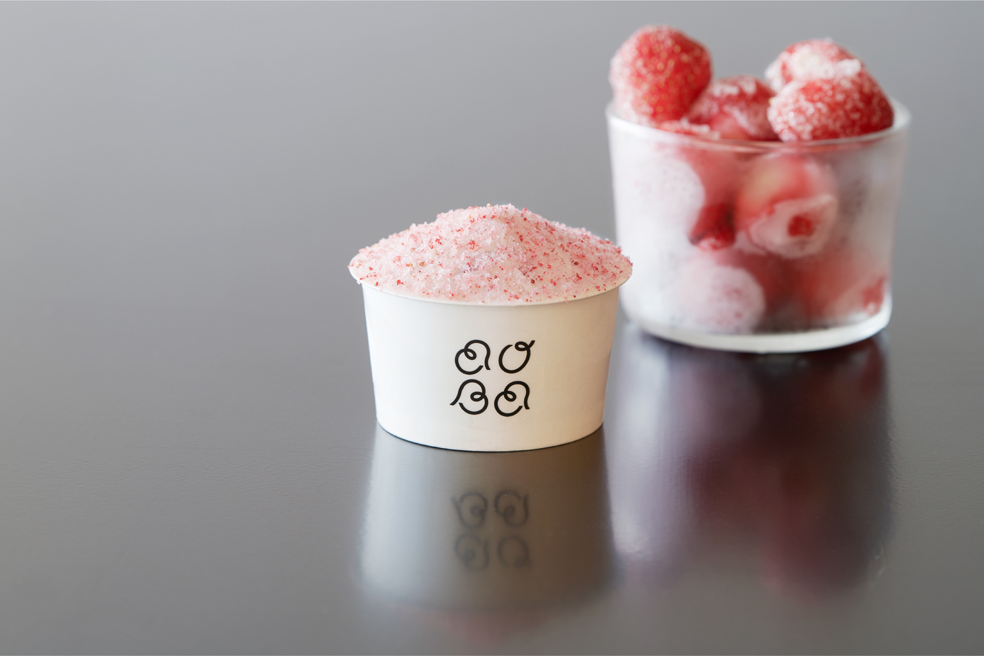
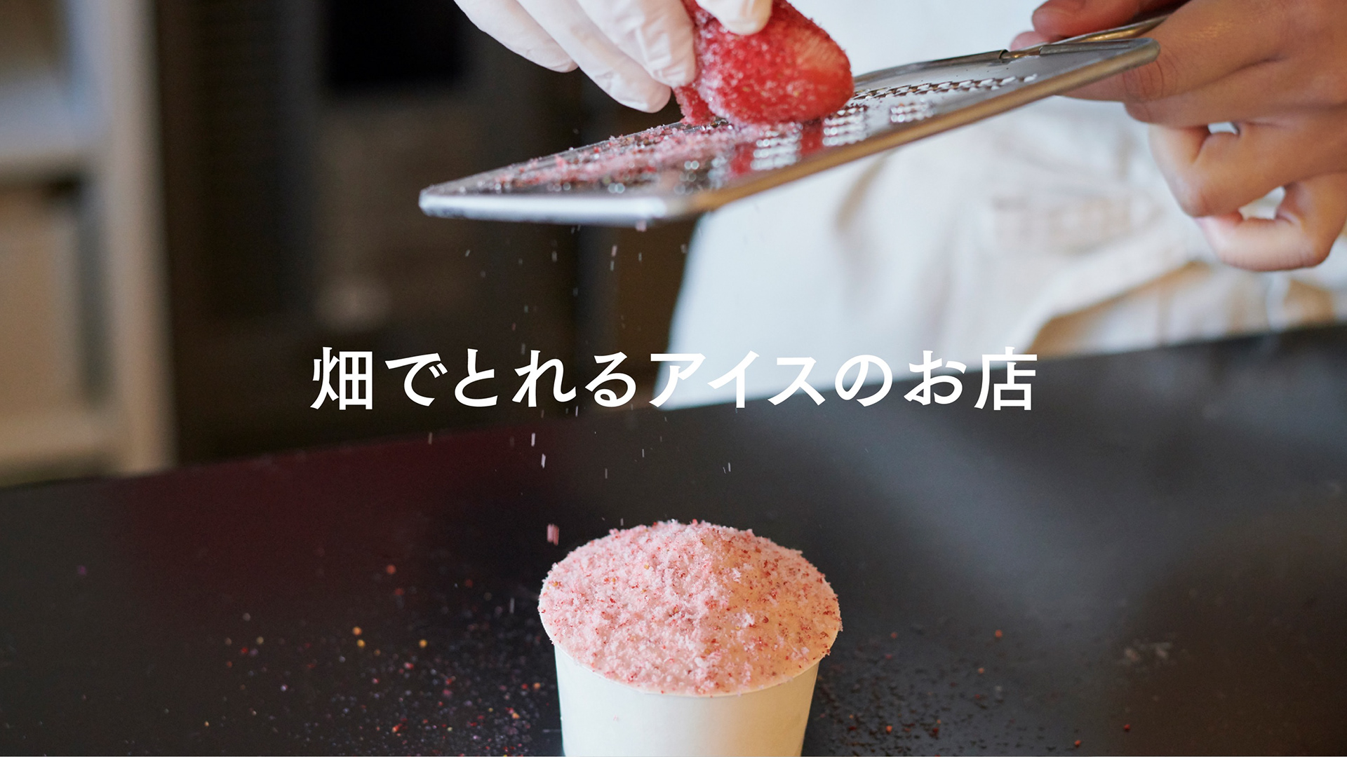
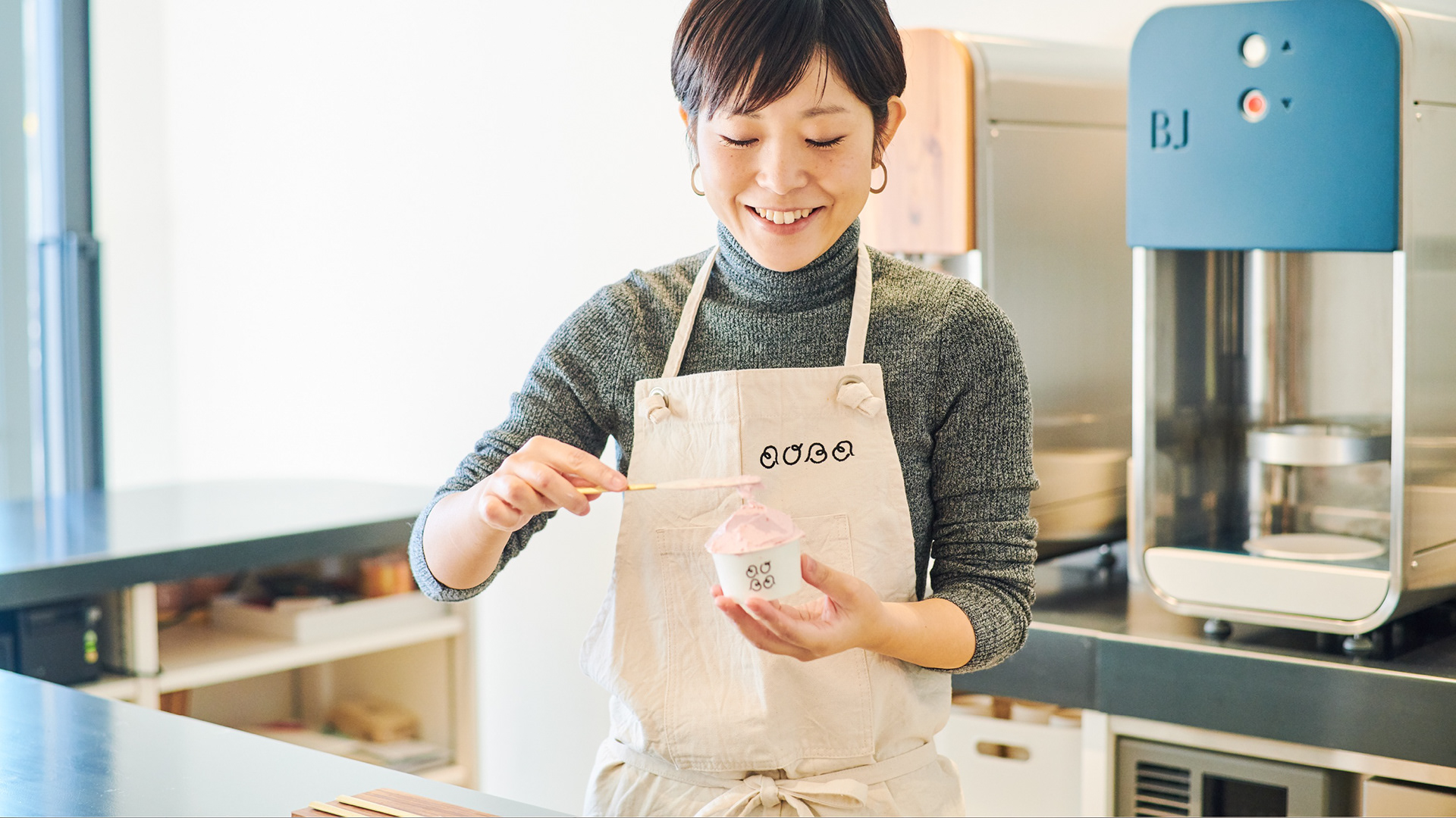
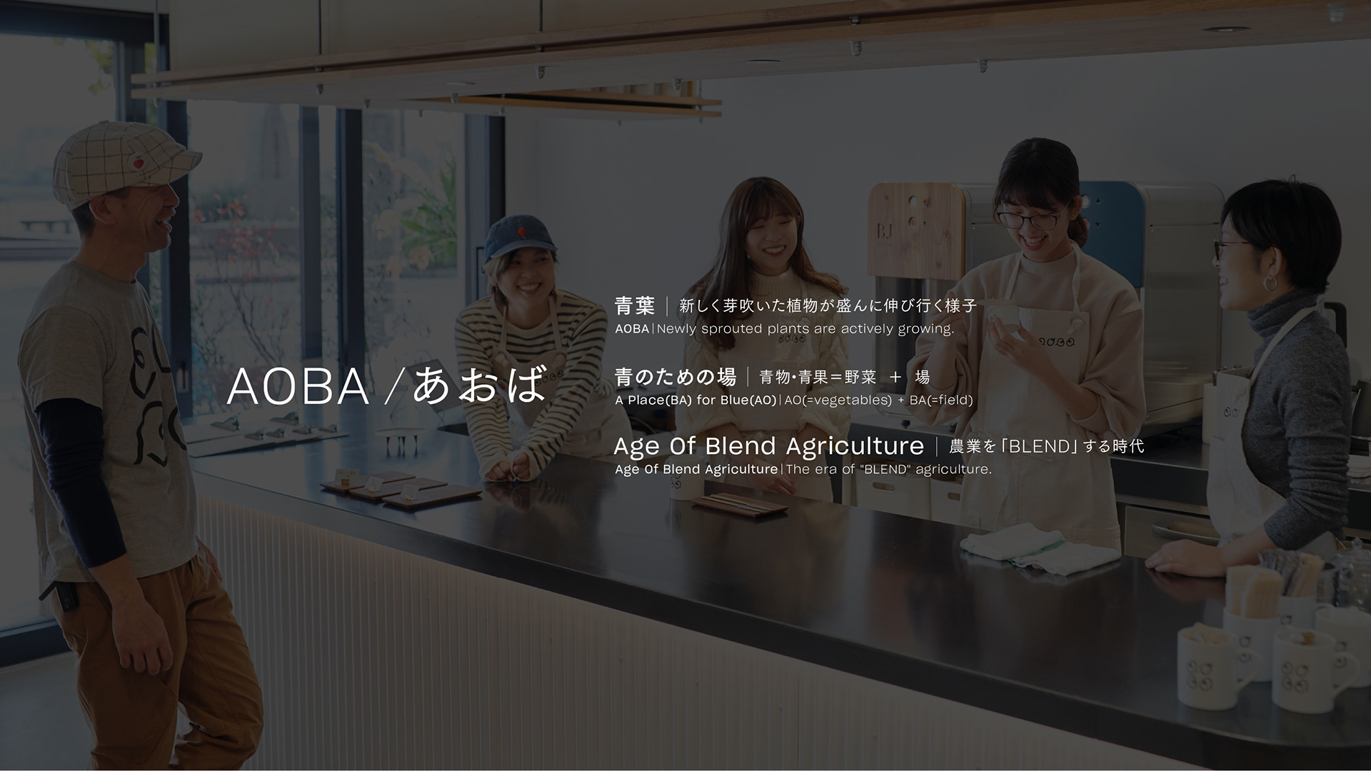
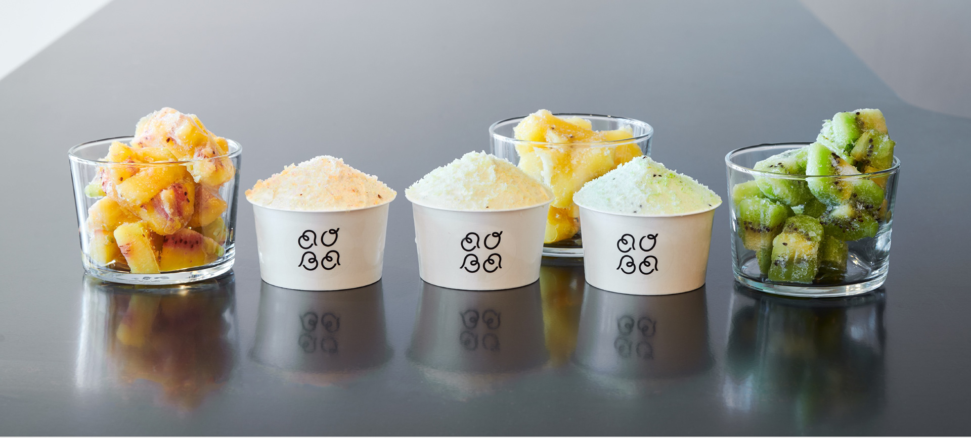
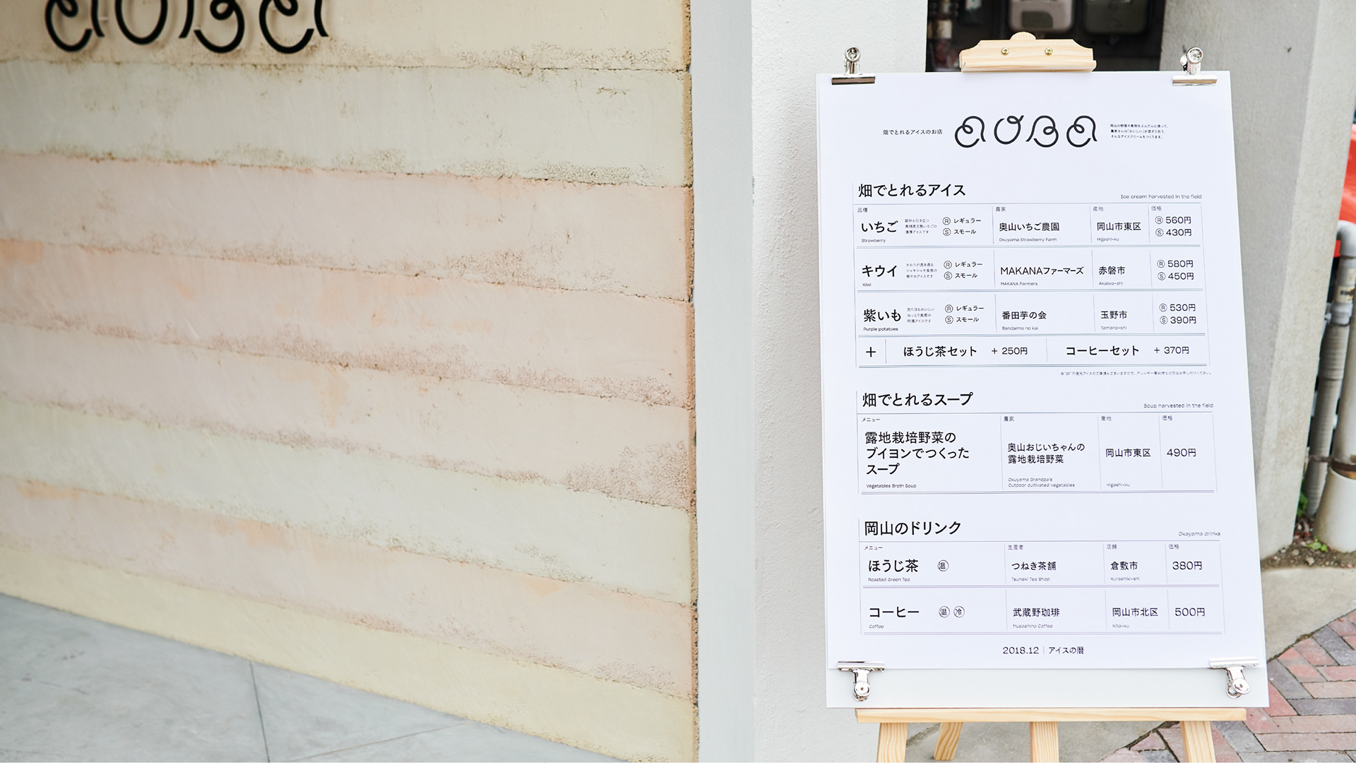
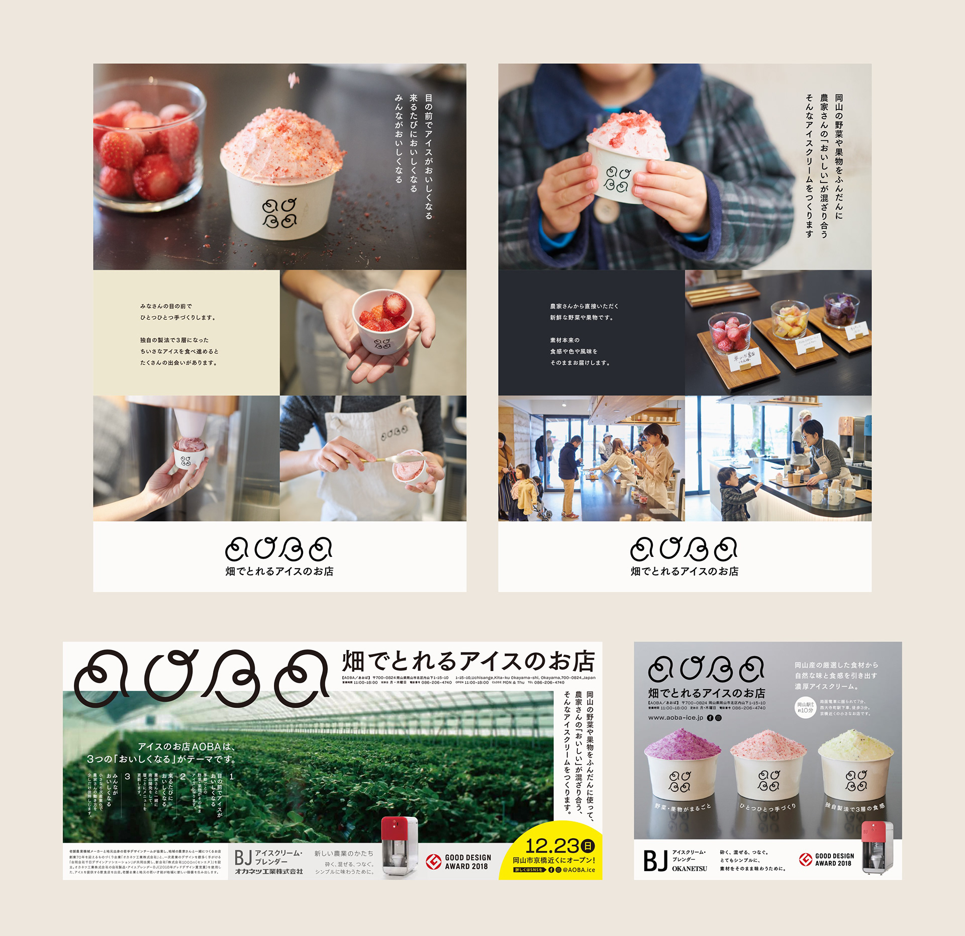
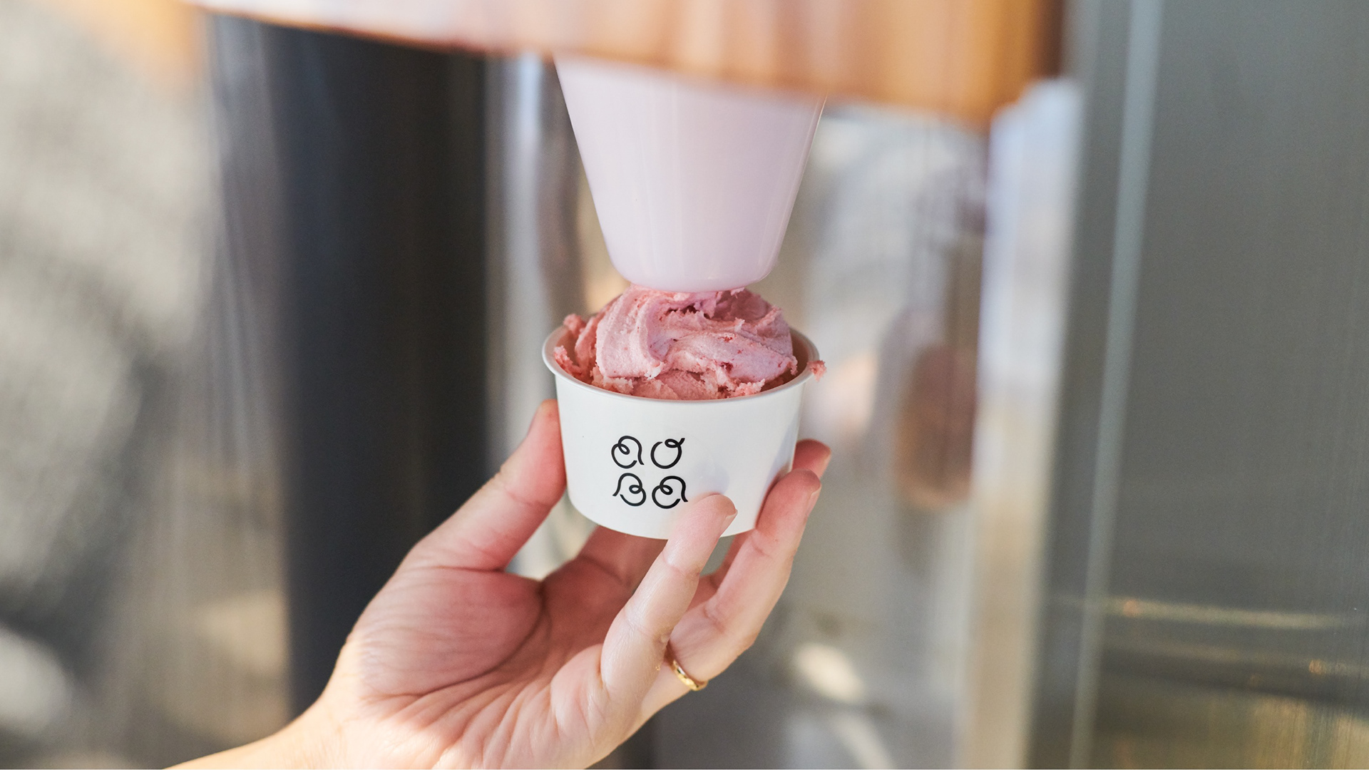
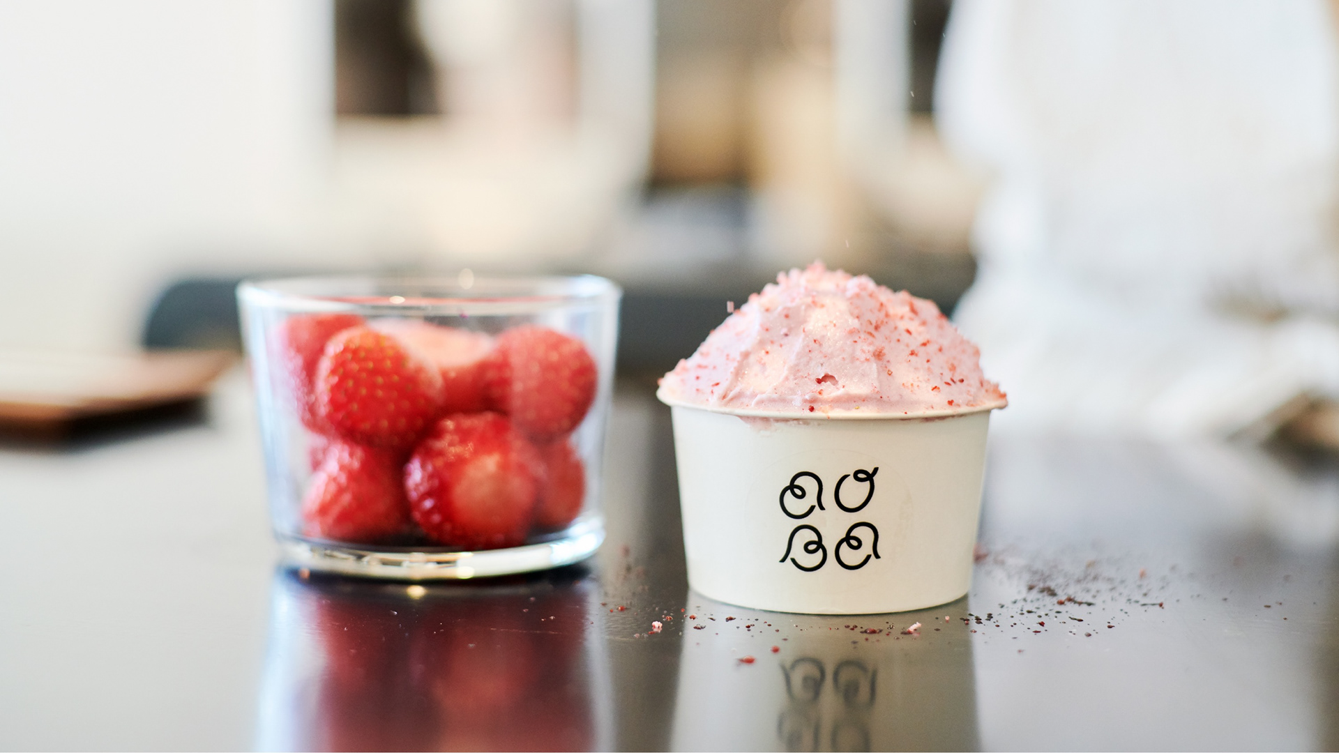
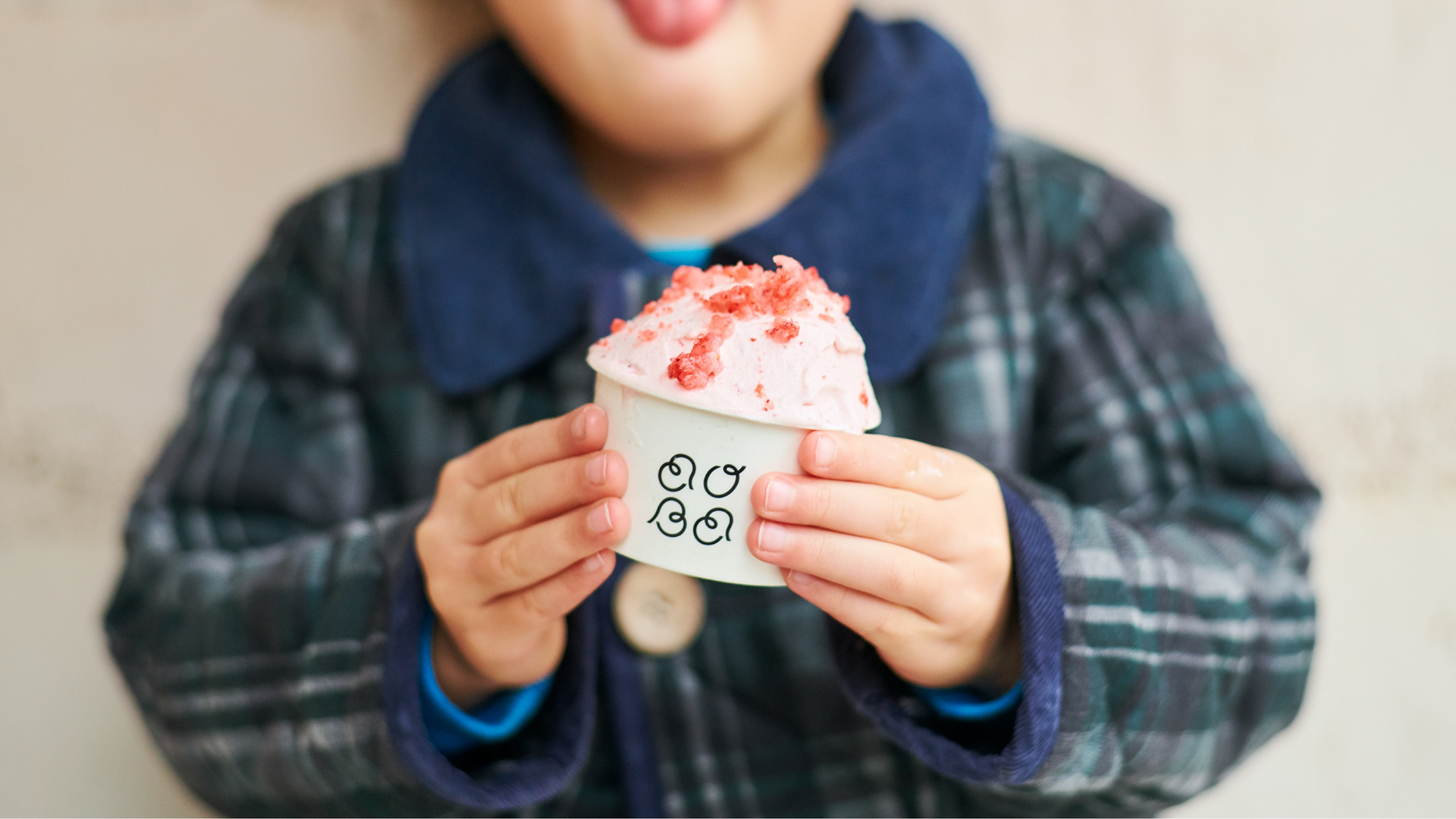
農家とともに歩むアイスクリーム店「畑でとれるアイスのお店 AOBA」。農業機械メーカーが開発したブレンダーを使用し、農家から直接届く野菜や果物をそのままアイスクリームにするお店です。事業のグランドデザインから参画し、事業コンセプトを策定。店名とキャッチコピーの考案とともに、ブランディングとVIの開発を行いました。事業について、詳しくはこちらをご覧ください。
AOBA is an ice cream store that works together with farmers. Using a blender developed by an agricultural machinery manufacturer, vegetables and fruits delivered directly from farmers are made into ice cream. We participated in the grand design of the business and formulated the business concept. We devised the store's name and catchphrase, and developed the branding and VI. For more information about the project, please click here.
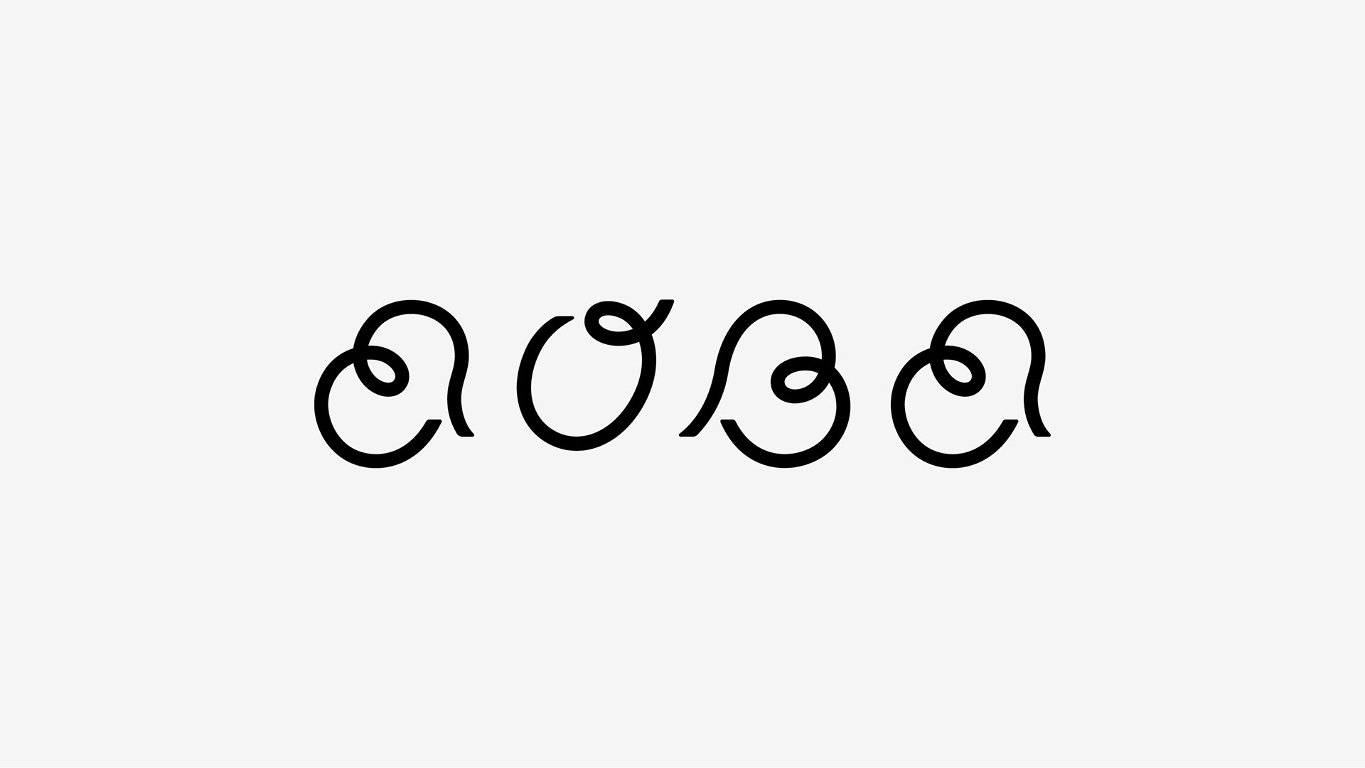
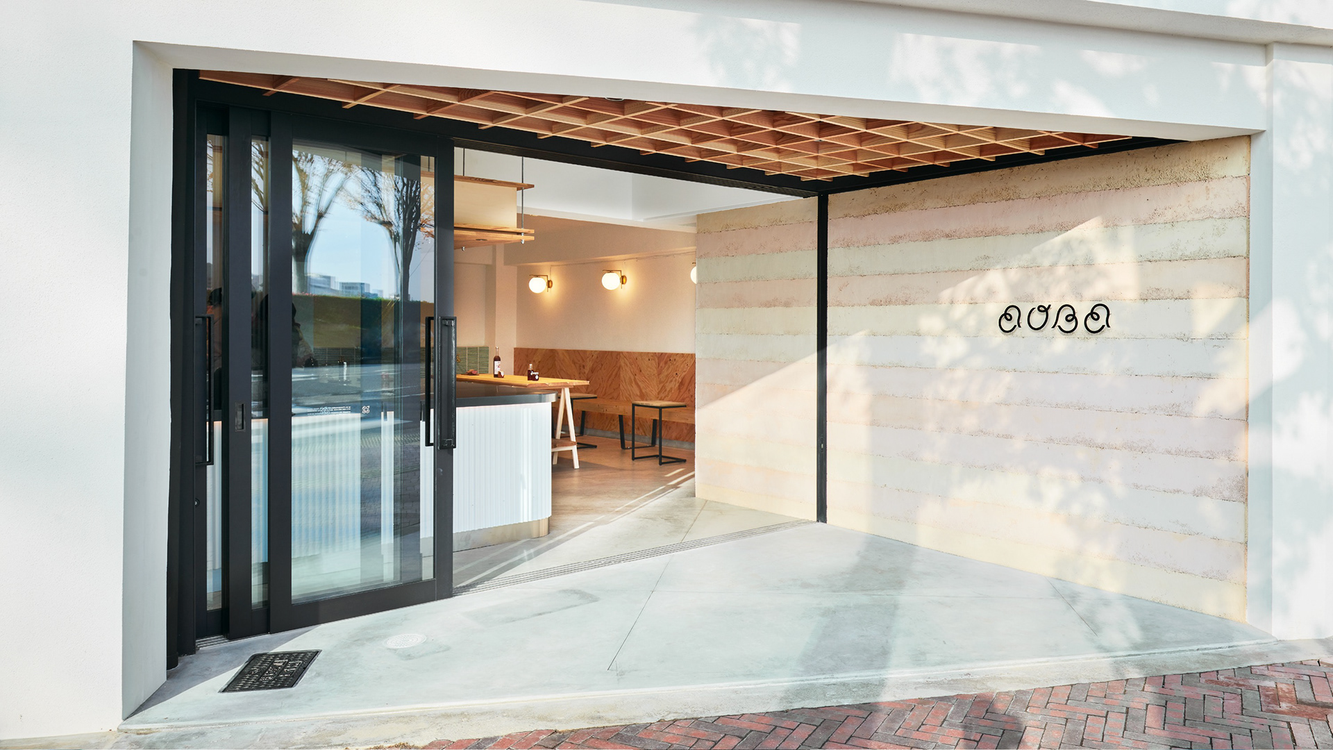
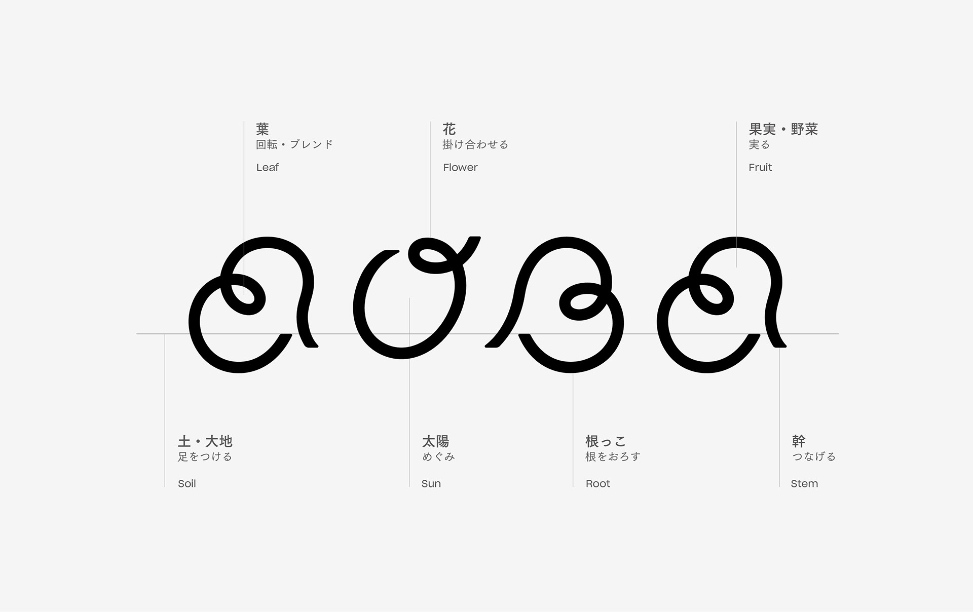
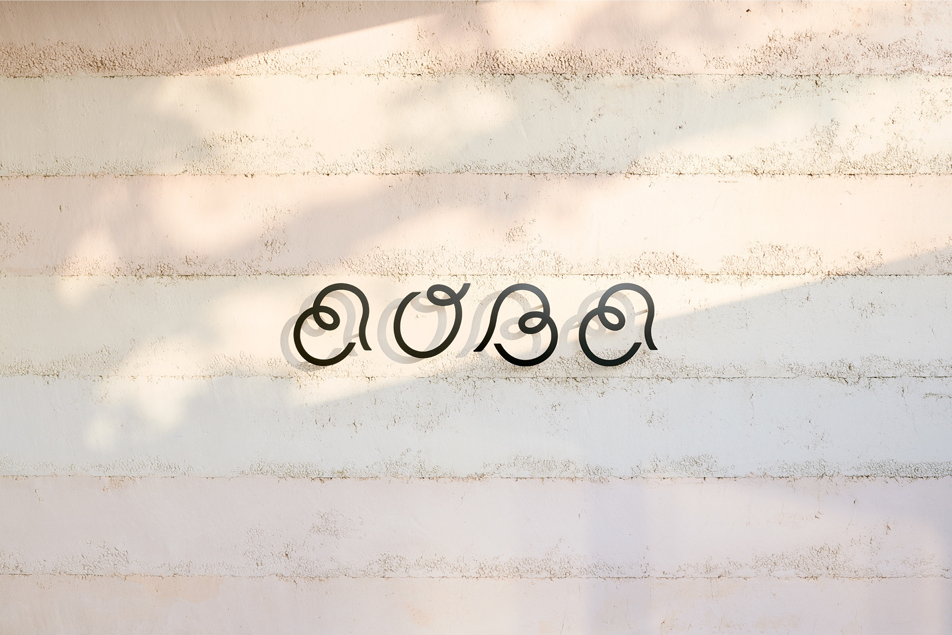
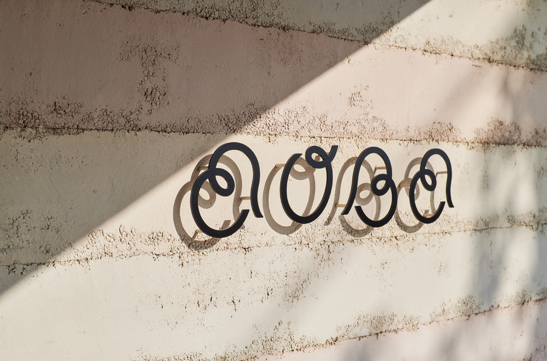
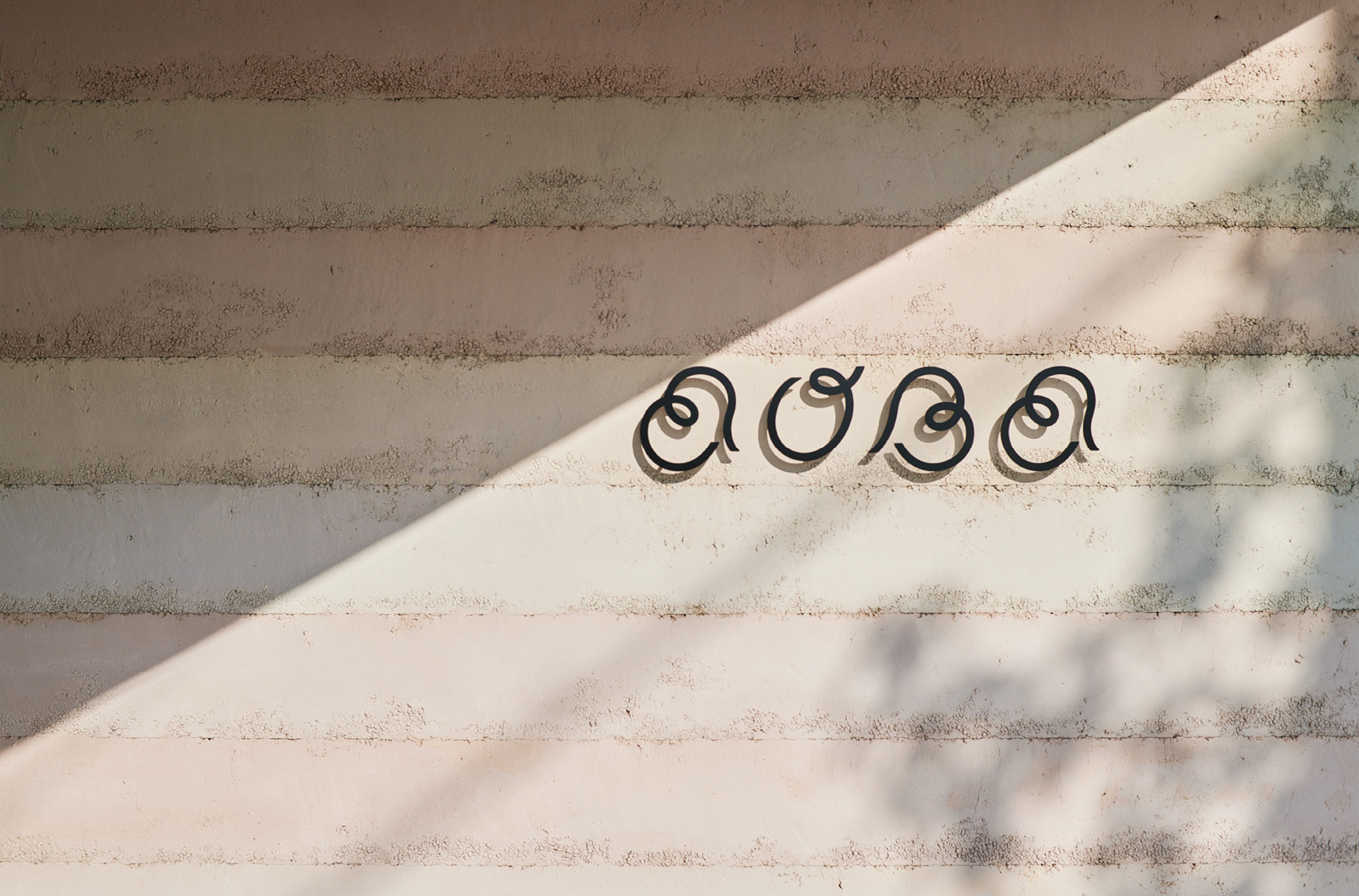
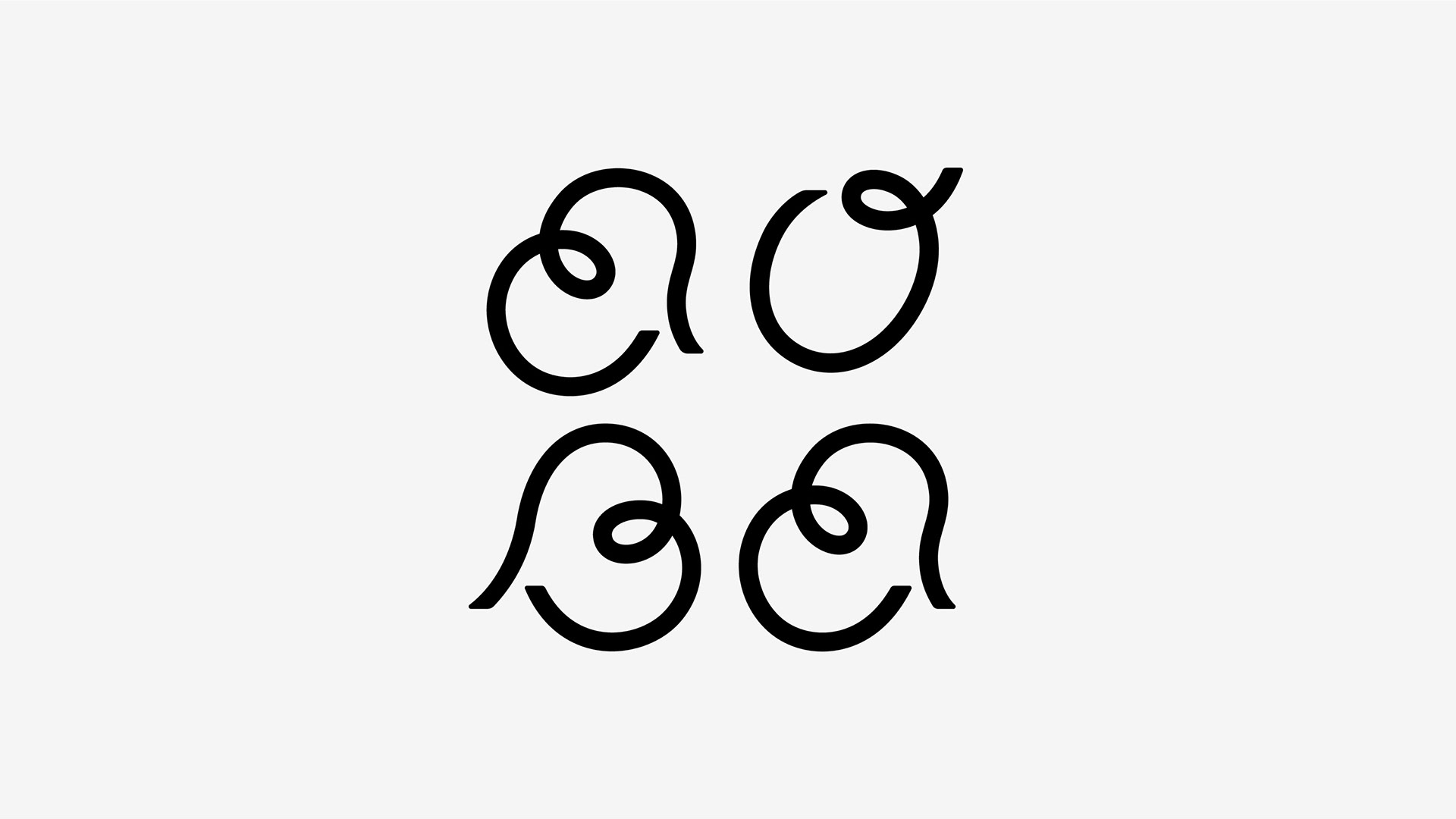
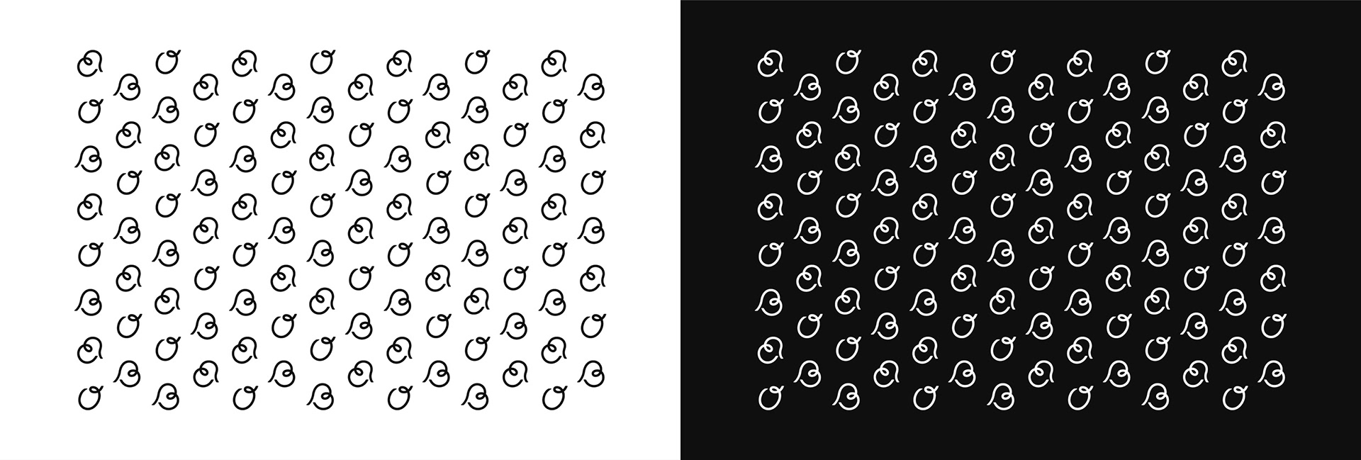
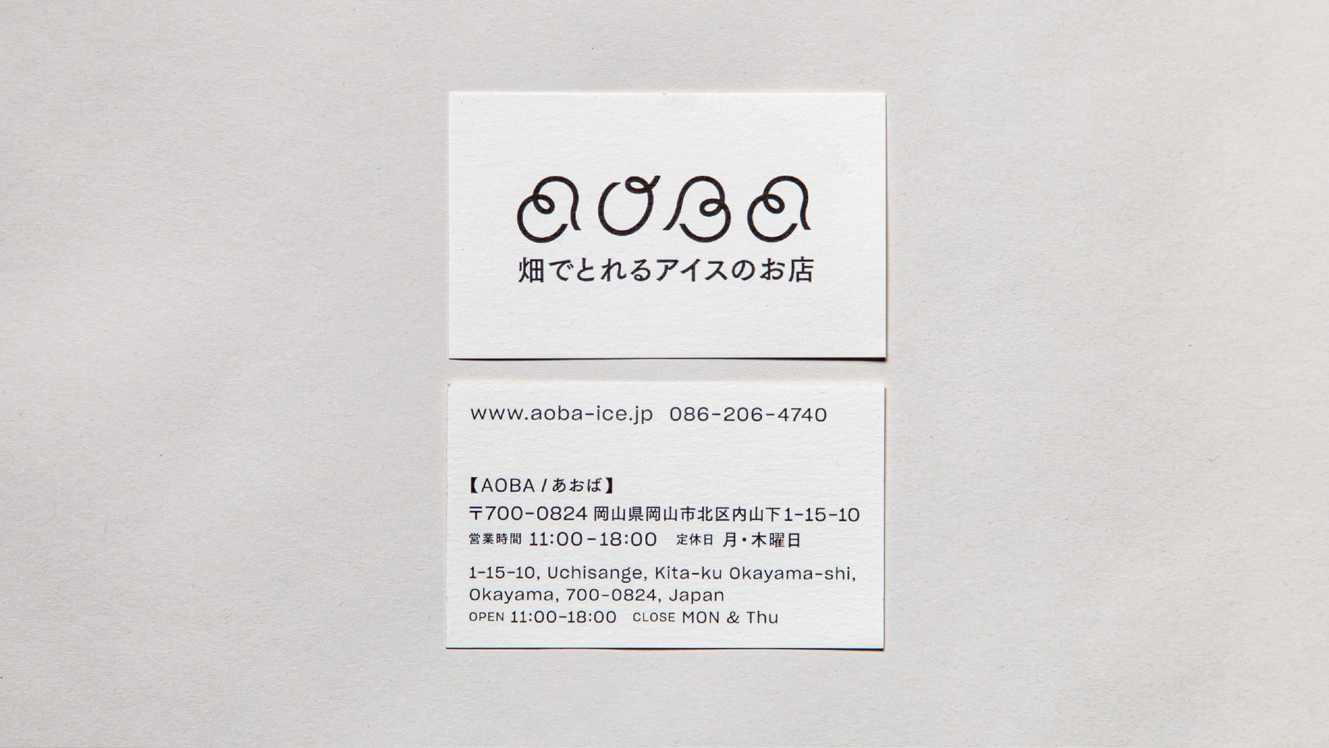
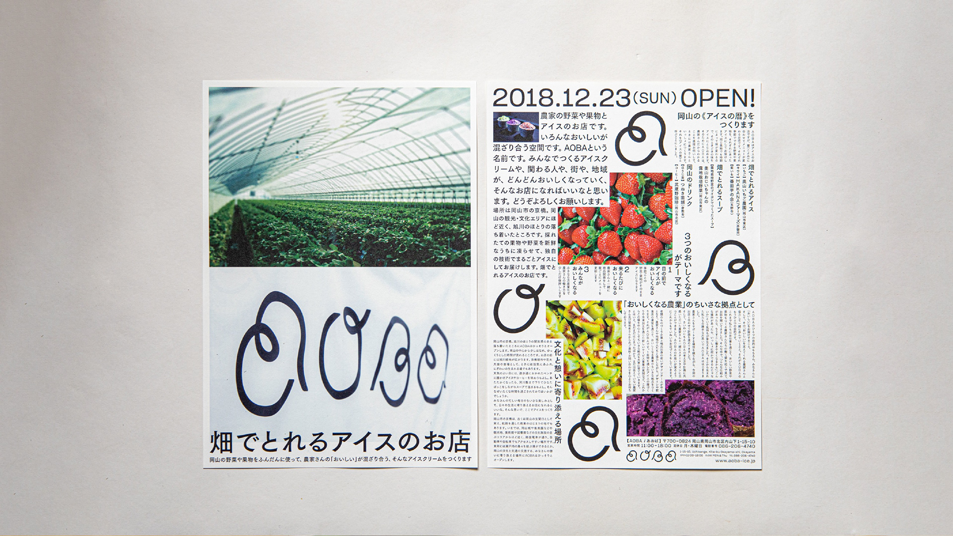
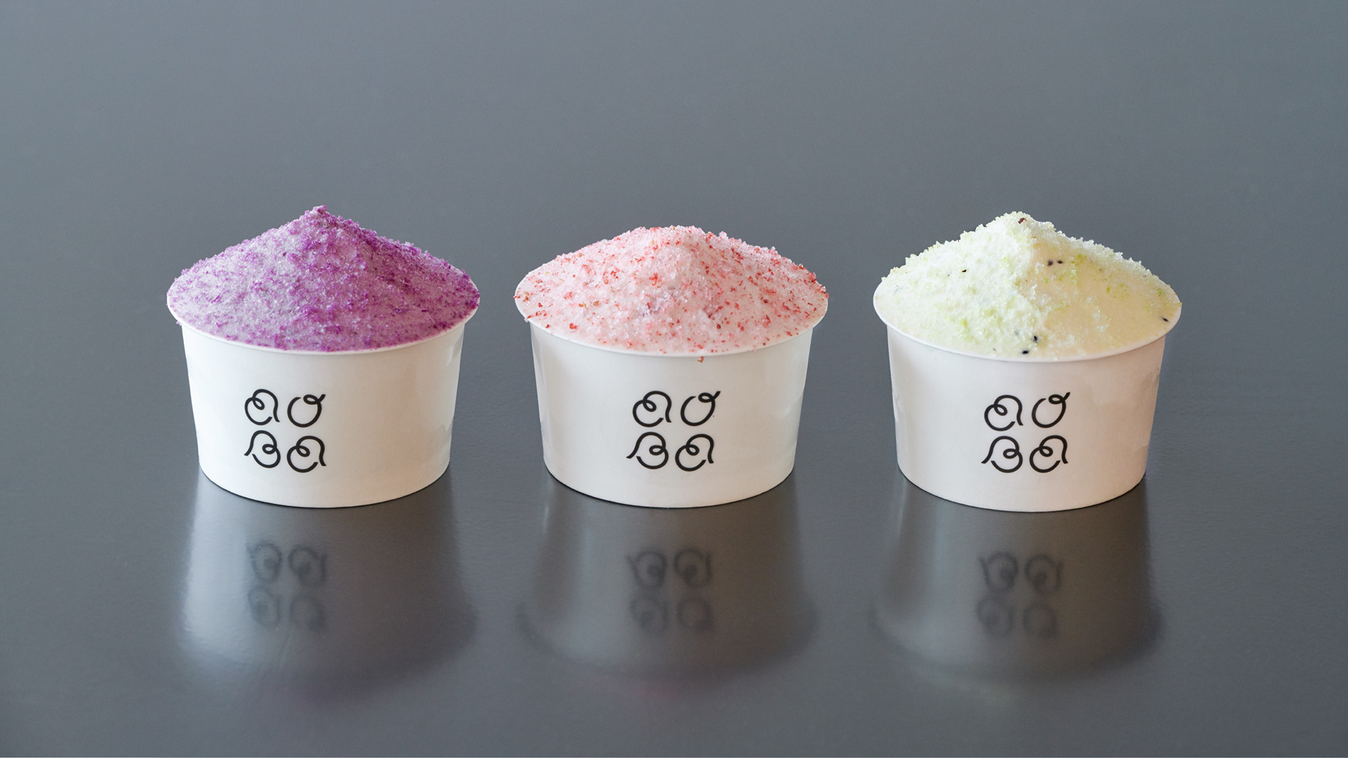
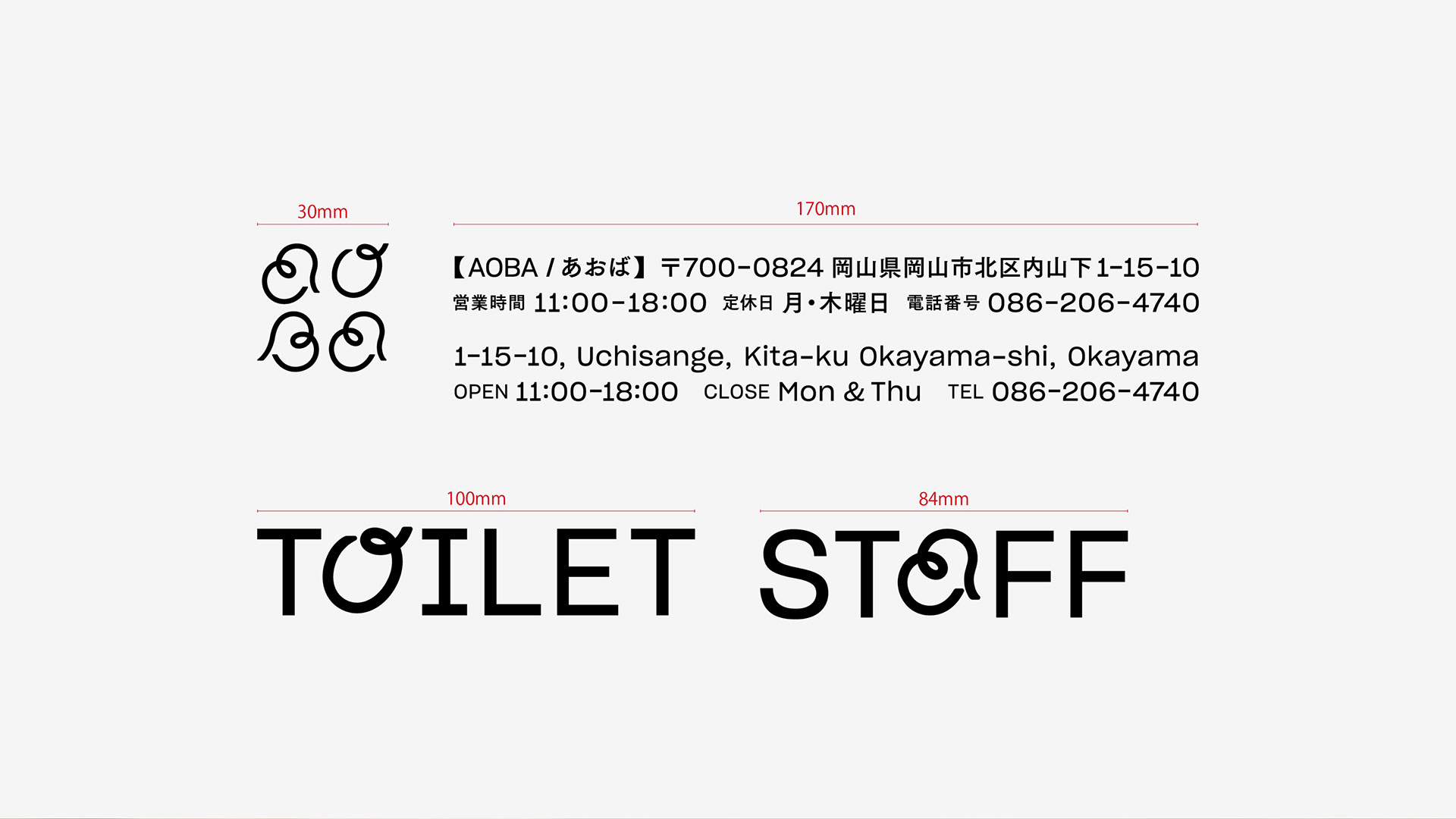
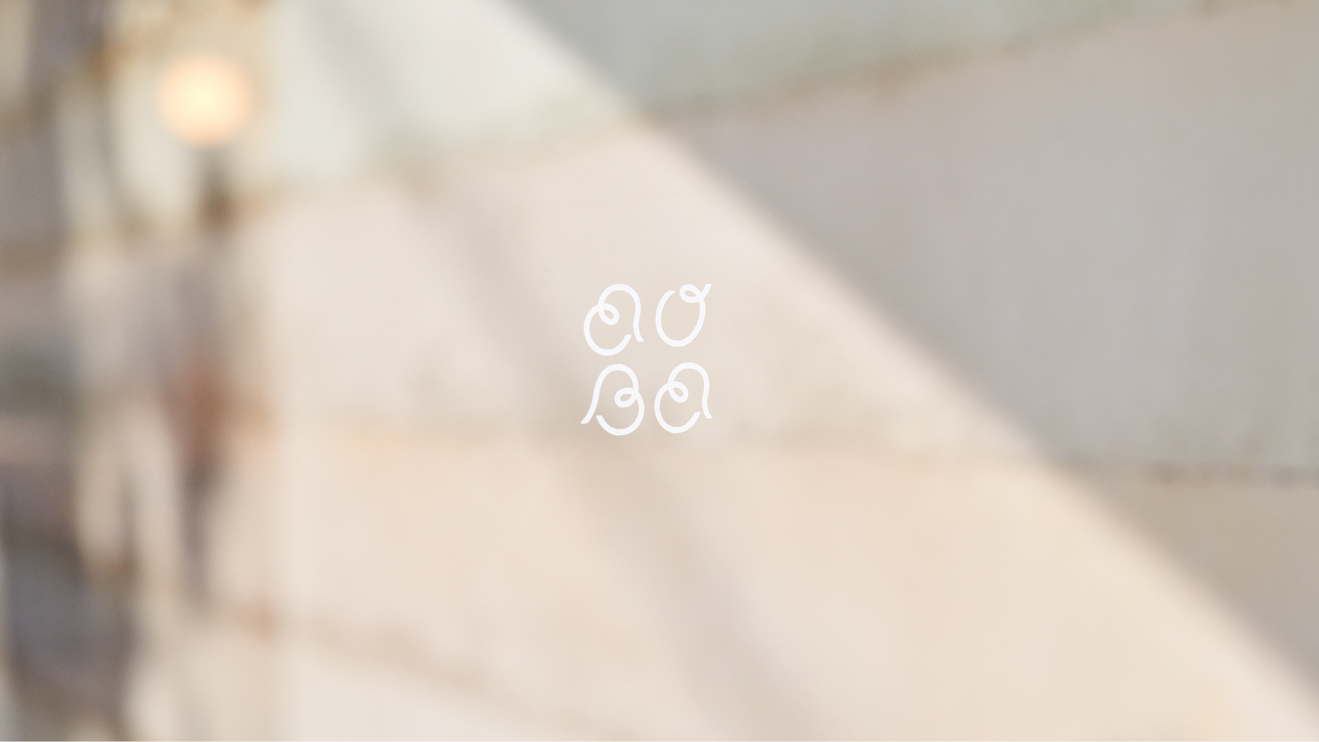
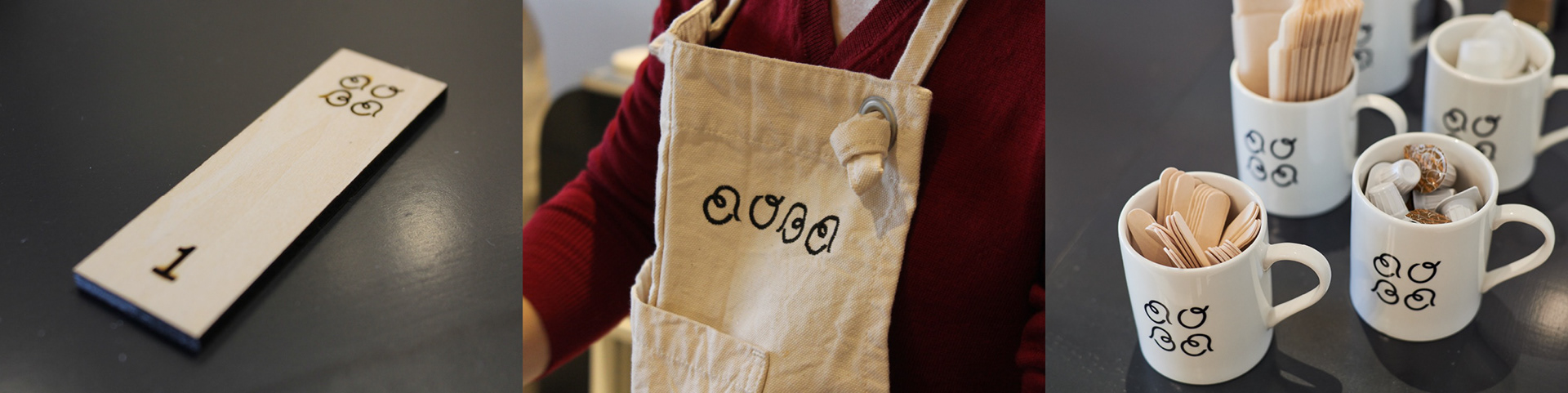
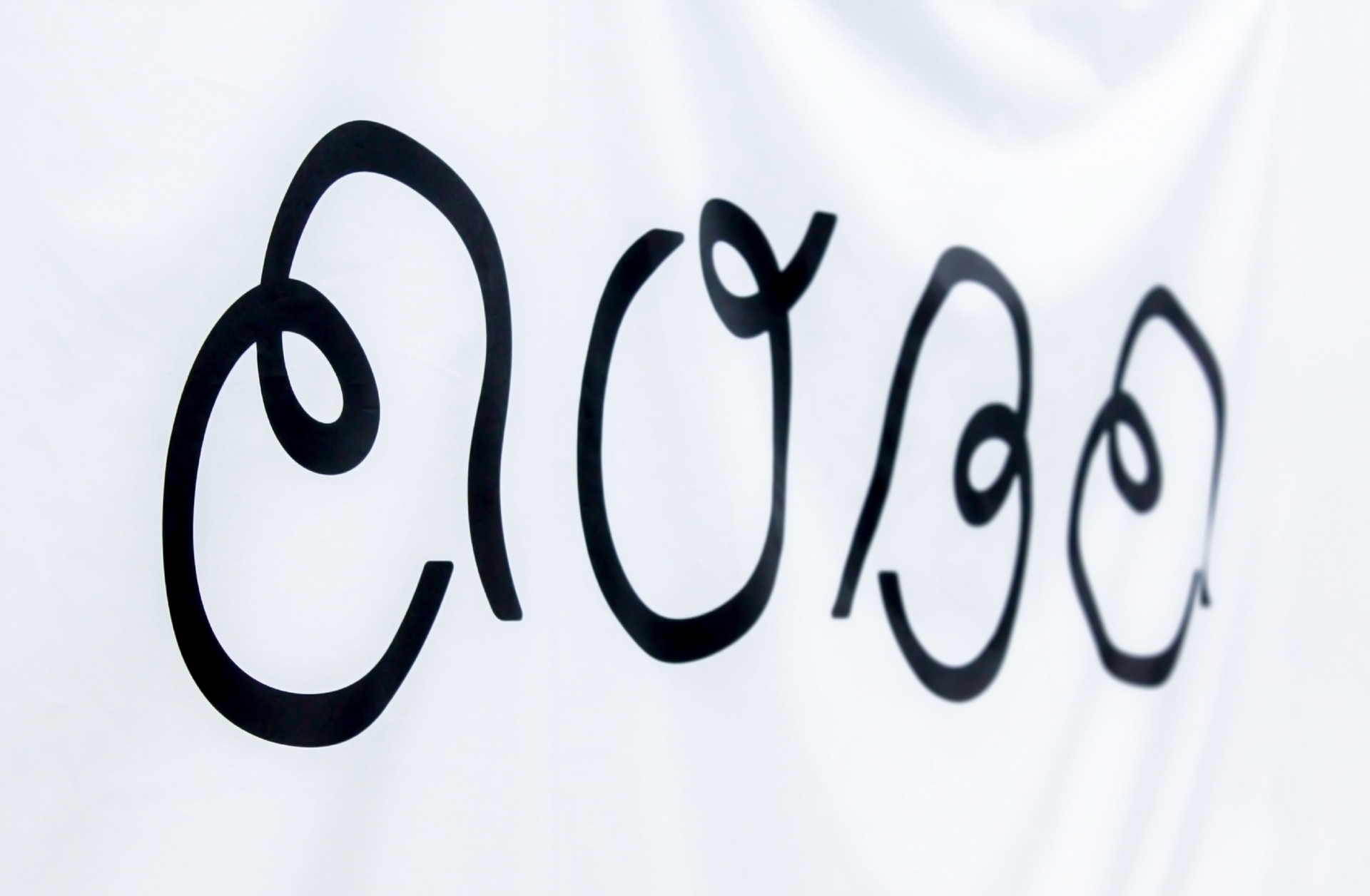
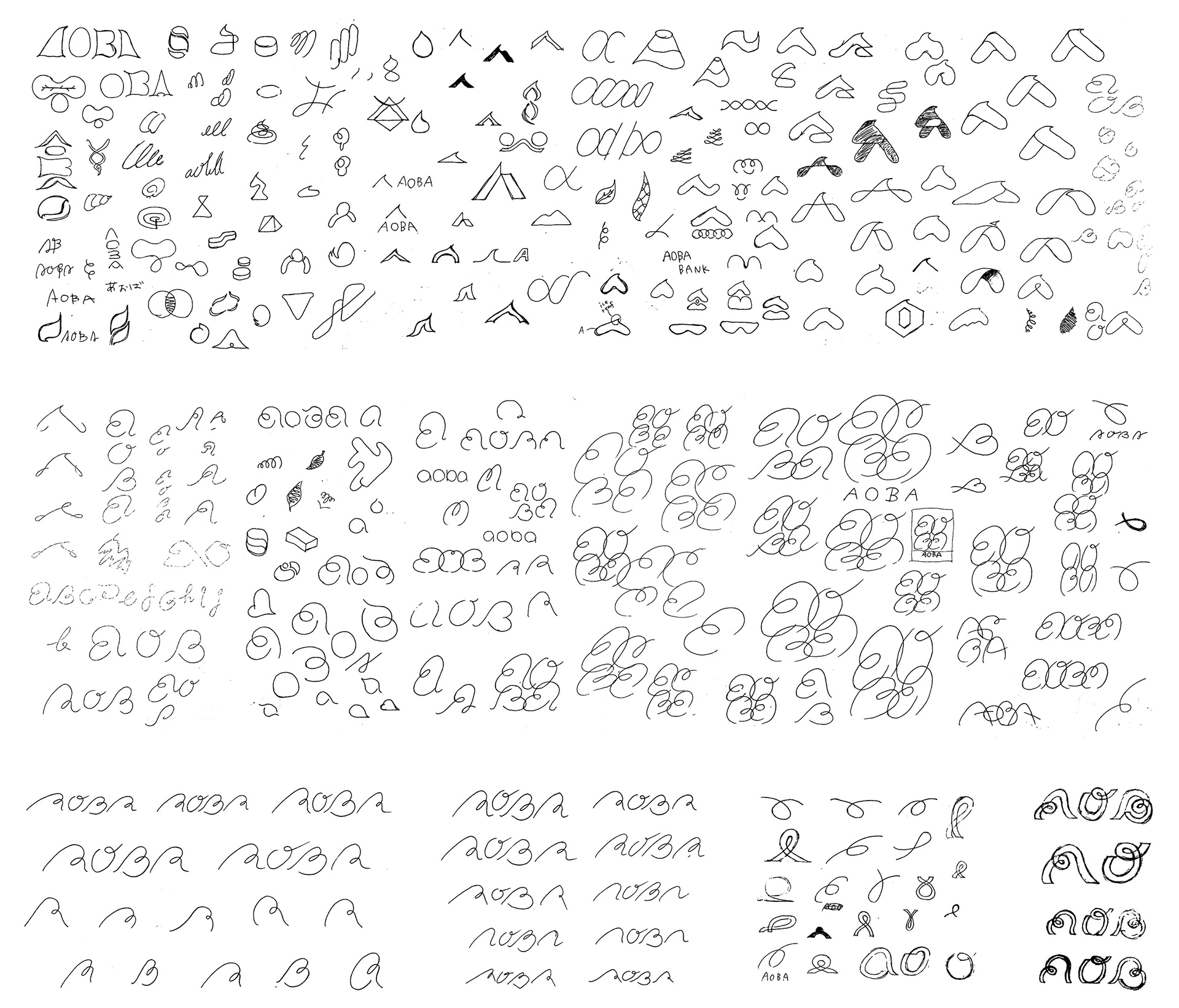
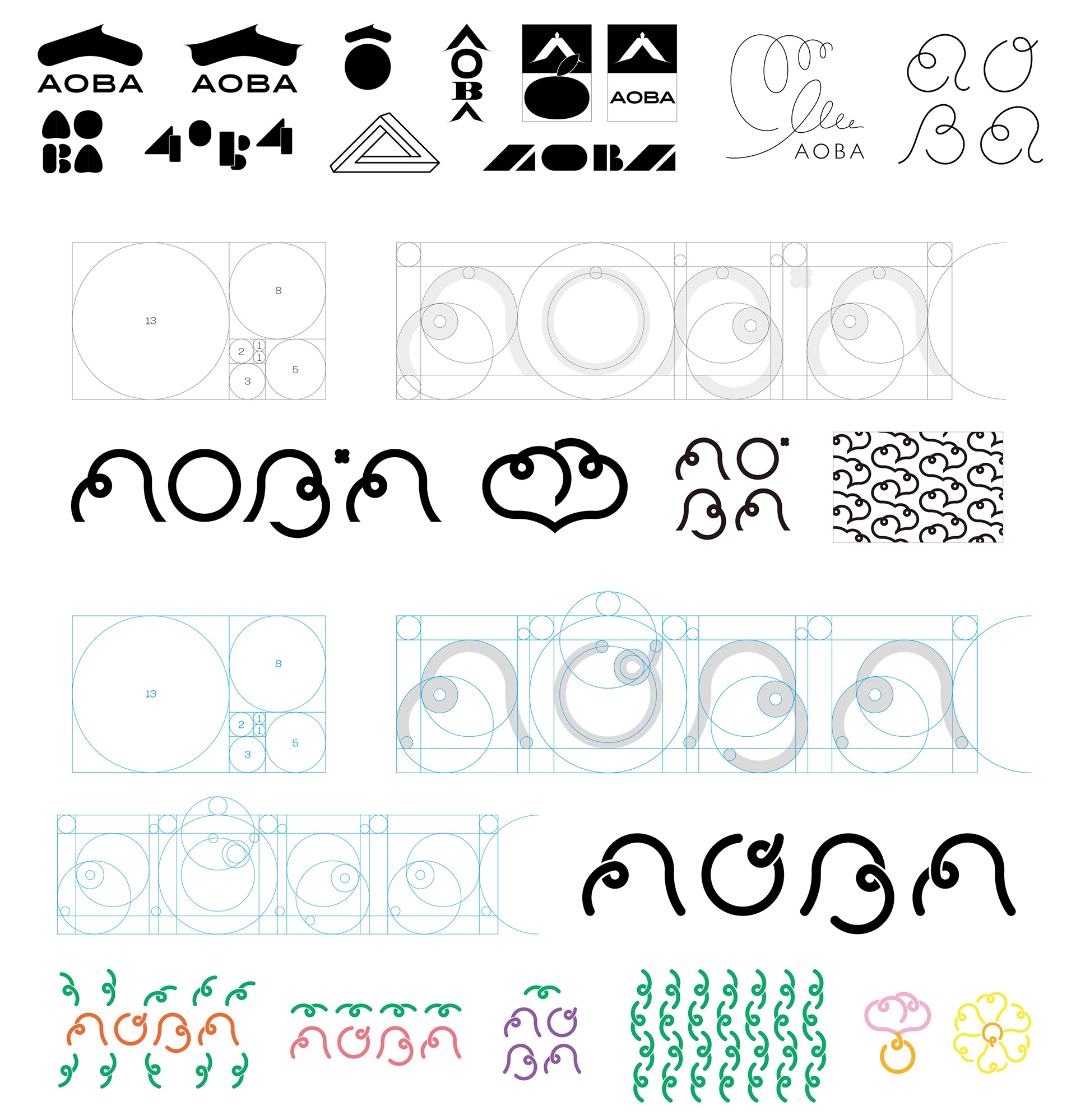
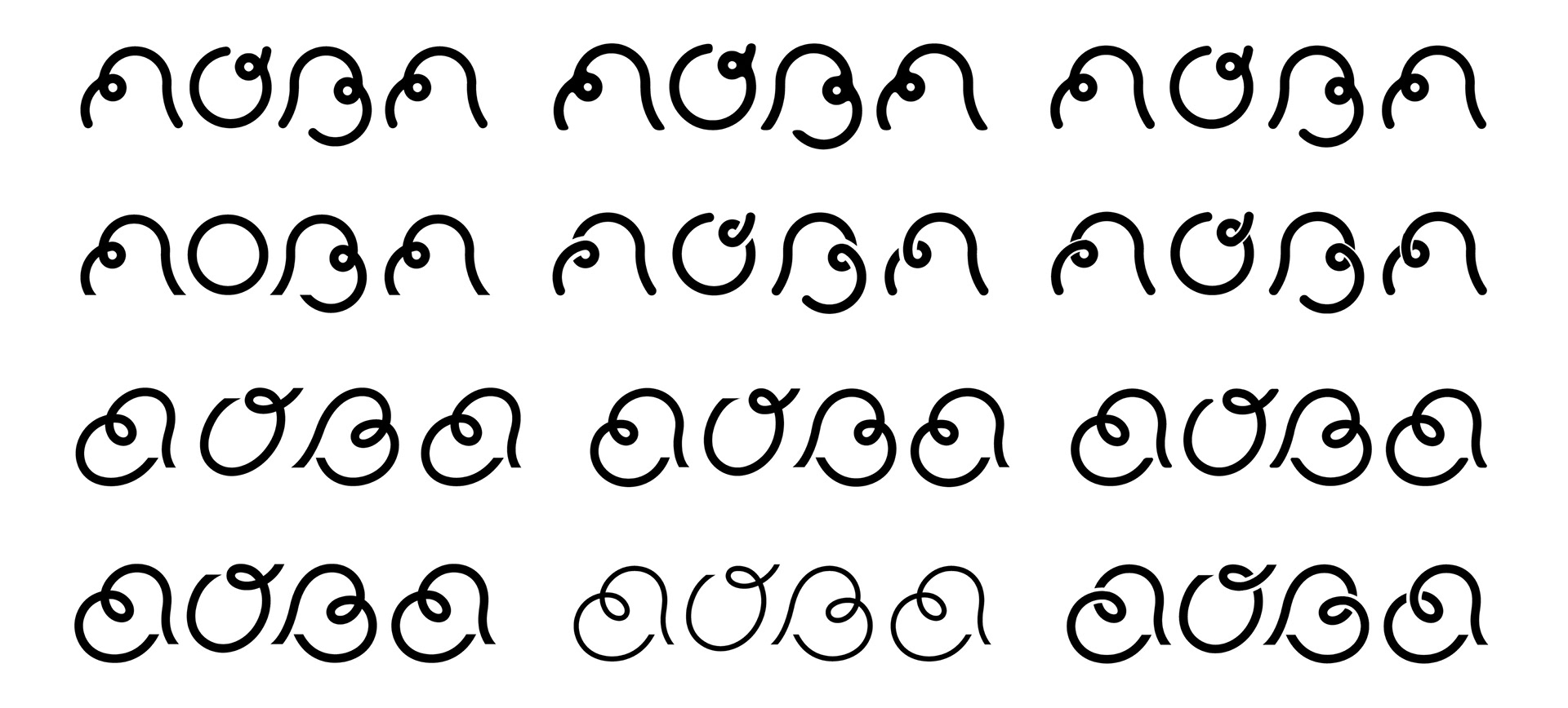
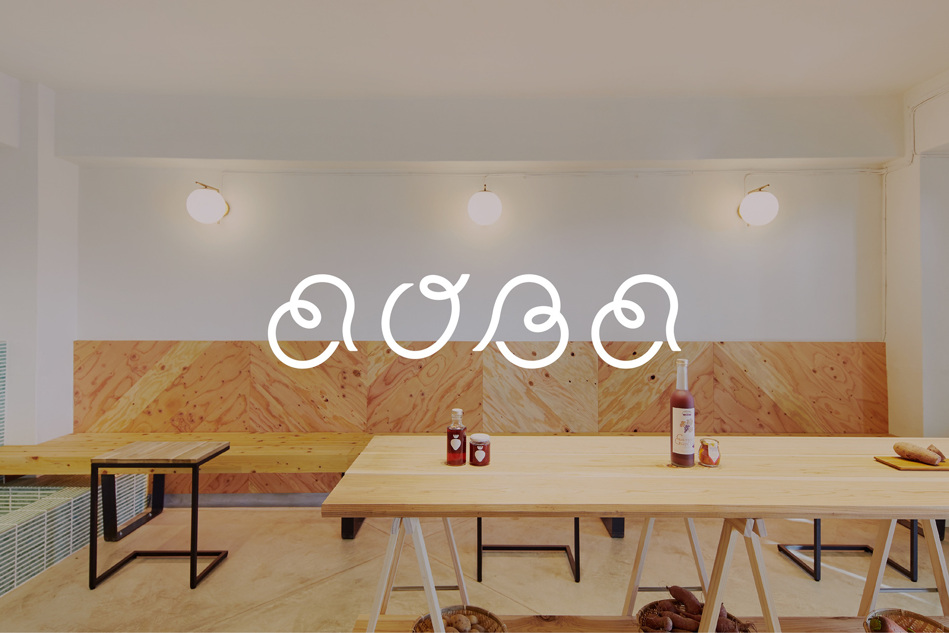
店名の由来のように「植物の成長」を思わせるロゴです。ロゴを構成する要素は、土、根、幹、葉、そして果実。自然の恵みからつくるアイスをイメージさせます。アイスの柔らかさを感じさせる滑らかなライン。自然が育む果実や野菜を想起させる優しいフォルム。ブレンドが生み出す“くるりん”がチャームポイントです。
The logo is reminiscent of "the growth of plants," just like the origin of the store name. The elements that make up the logo are soil, roots, trunk, leaves, and fruit. It evokes the image of ice cream made from nature's bounty. The smooth lines evoke the softness of ice cream. The gentle form reminds us of fruits and vegetables grown by nature. The "round" created by the blending is a charm point.
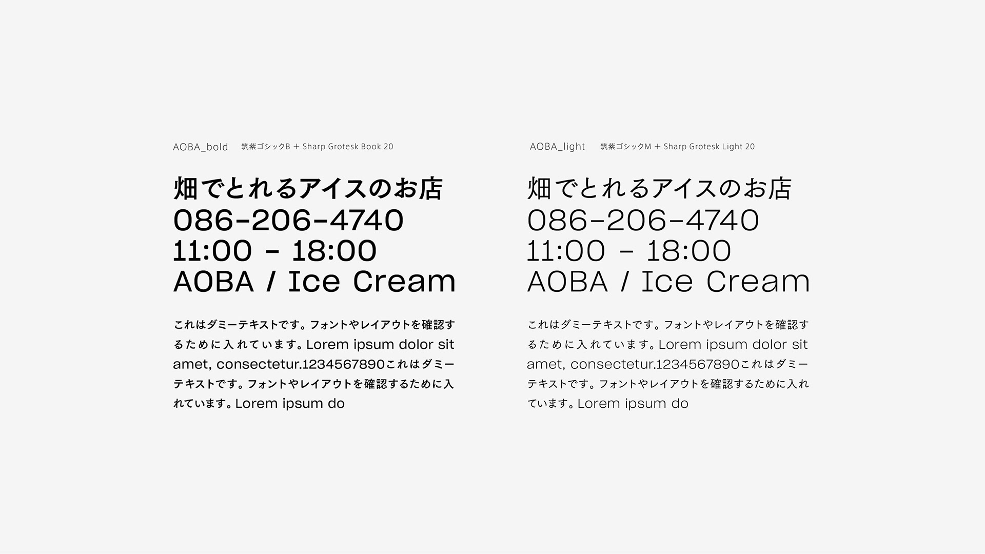
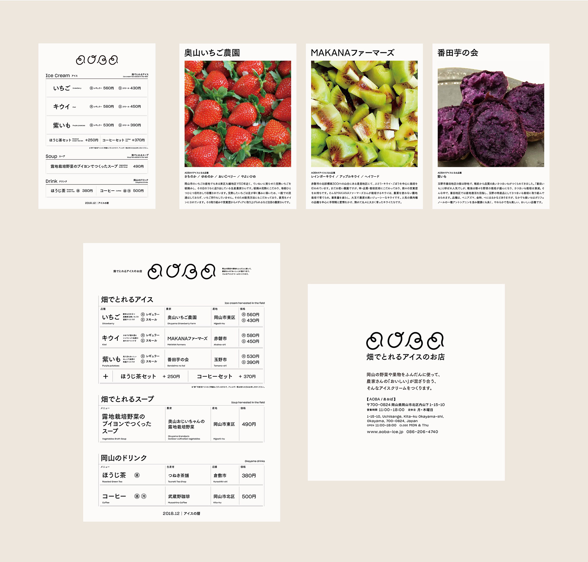
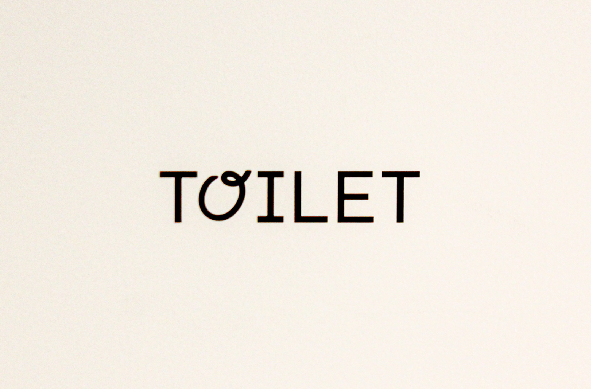
AOBA fontsはAOBA BoldとAOBA lightの2ウェイトからなる合成フォントです。和文・欧文ともにトラディショナルなつくりでありながら、文字のふところを広くとり、ゆったりした印象のゴシック/サンセリフ書体を使用しています。AOBAロゴに合わせ、有機的な曲線で表現されつつ統率の取れた書体を用いることで、気品がありながら親しみの持てる印象をビジュアルに与えます。店舗サインなどに用いる際に視認性が高く、文字の大小かかわらず読みやすいため、ユニバーサルデザインとしても優れています。
AOBA fonts is a composite font consisting of two weights, AOBA Bold and AOBA Light. Both the Japanese and European versions use a traditional gothic/sans-serif typeface with wide character spaces and a relaxed impression.In line with the AOBA logo, the use of a well-defined typeface with organic curves gives the visual impression of elegance and friendliness.The typeface is highly visible when used for store signs, and is easy to read regardless of the size of the letters, making it an excellent universal design.
丸みのある字面は文章になることでリズムを生み、読む楽しさを引き出します。縦組・横組、文字に強弱をつけるなどで、変則的ではあるが、より引き込まれる、幅の広さや取り組みの深みを印象としても備えます。伝えたい情報が多いからこそ、それを読む喜びにすることで伝わる形にしています。
The rounded letterforms create a rhythm in the text and bring out the pleasure of reading. The vertical and horizontal layouts, as well as the use of strong and weak characters, are irregular but draw you in, giving you the impression of breadth and depth of approach. Because there is so much information to be conveyed, it is made into a form that is conveyed by making it a pleasure to read.
Award : 日本タイポグラフィ年鑑2020 入選
Art Direction, Design : Okuyama Taiki | Sennichi Design Association
Design : Miyake Hiroaki | Sennichi Design Association
Design : Miyake Hiroaki | Sennichi Design Association
Creative Direction : Otokura Shinji | Sennichi Design Association