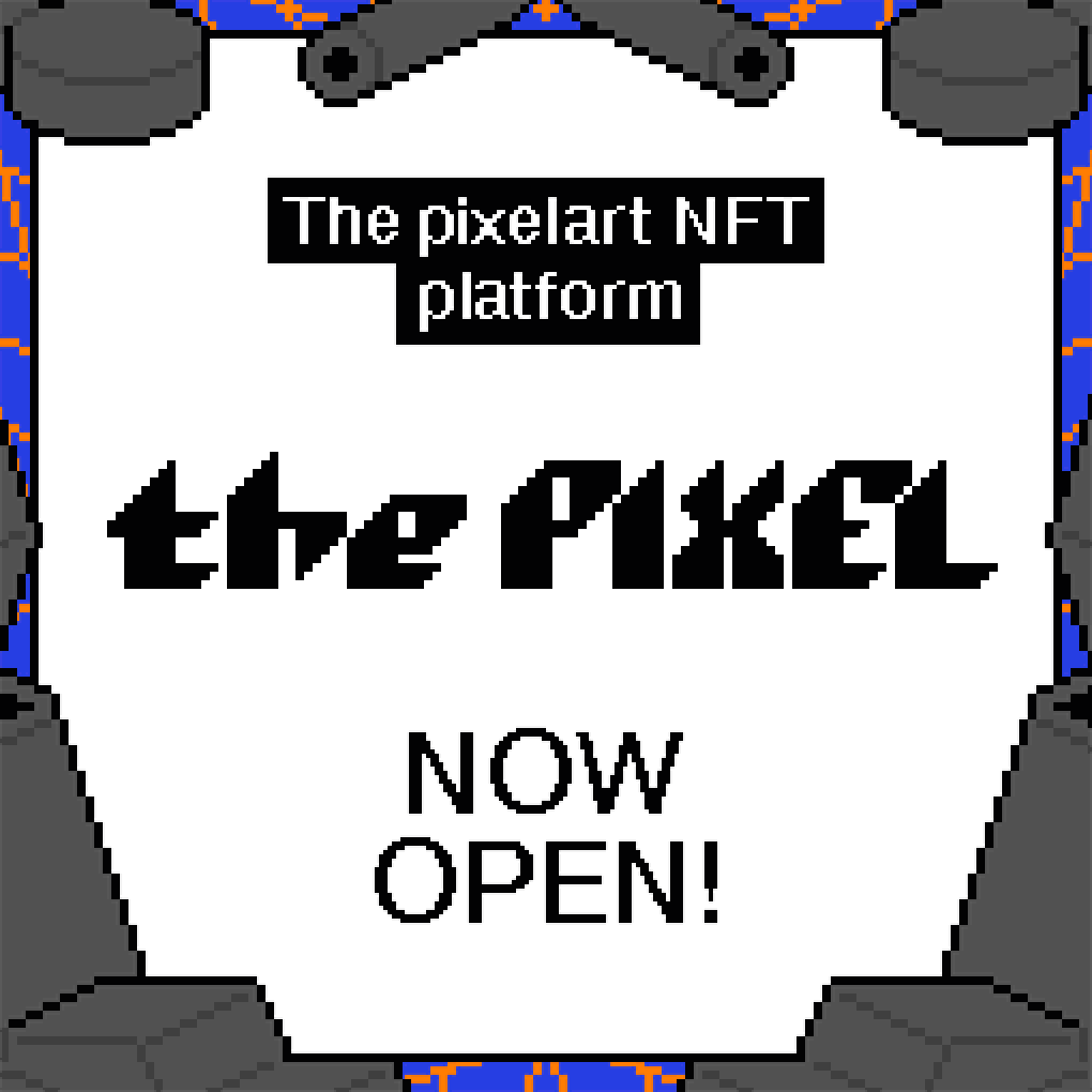
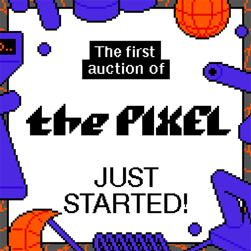

the PIXEL
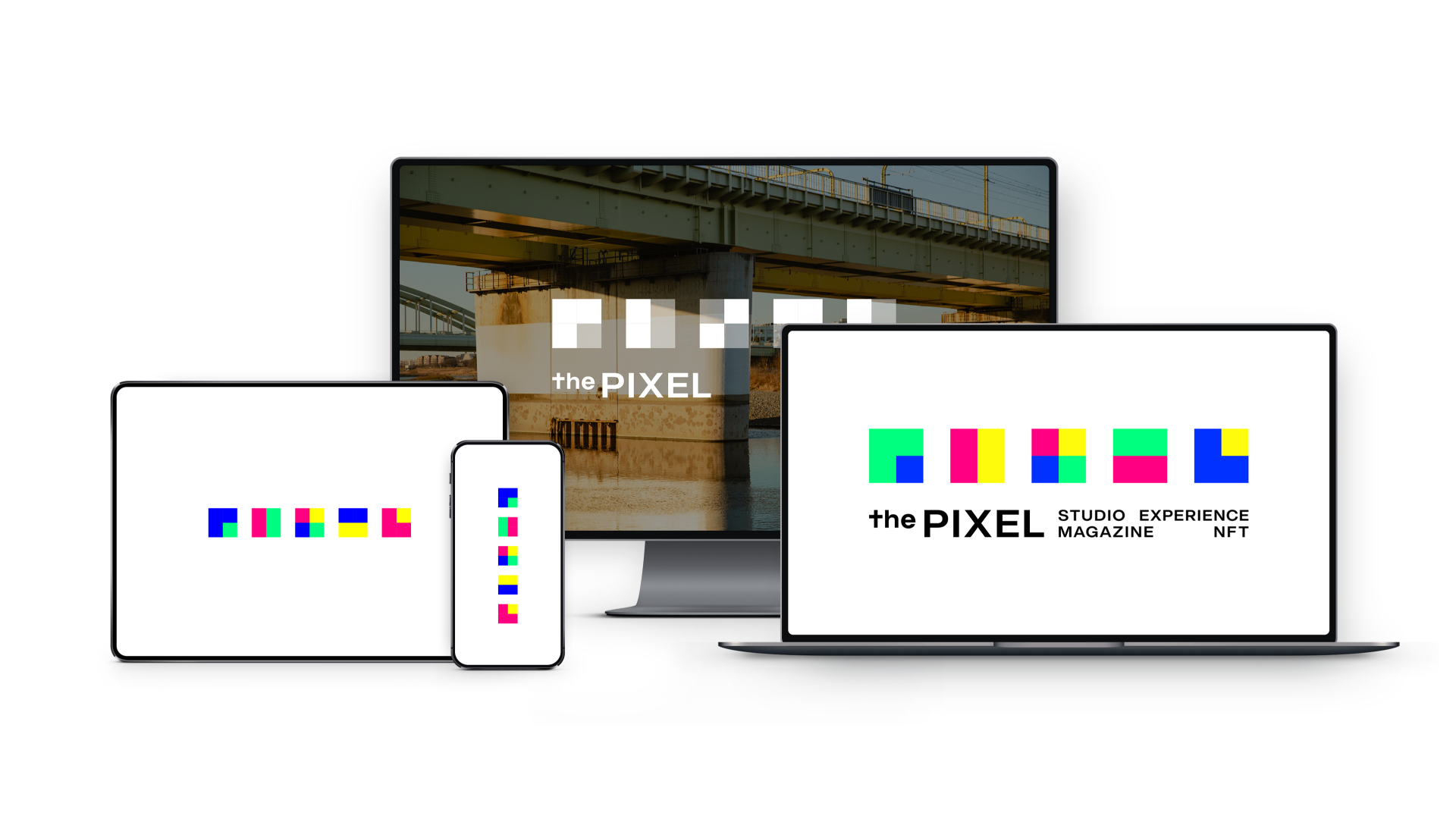
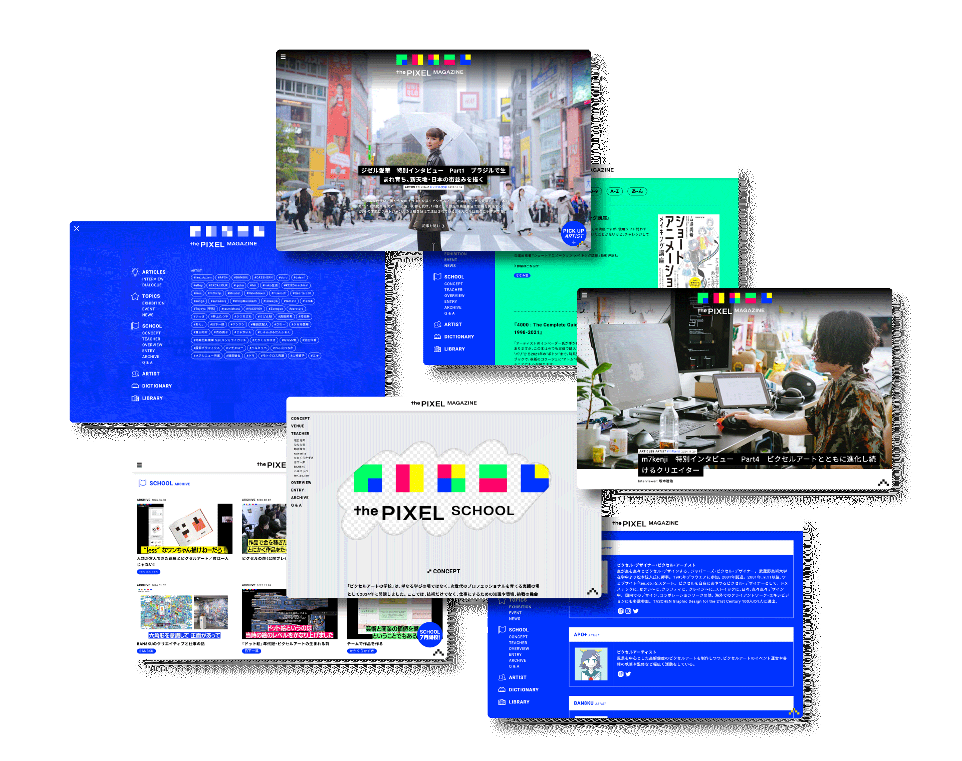
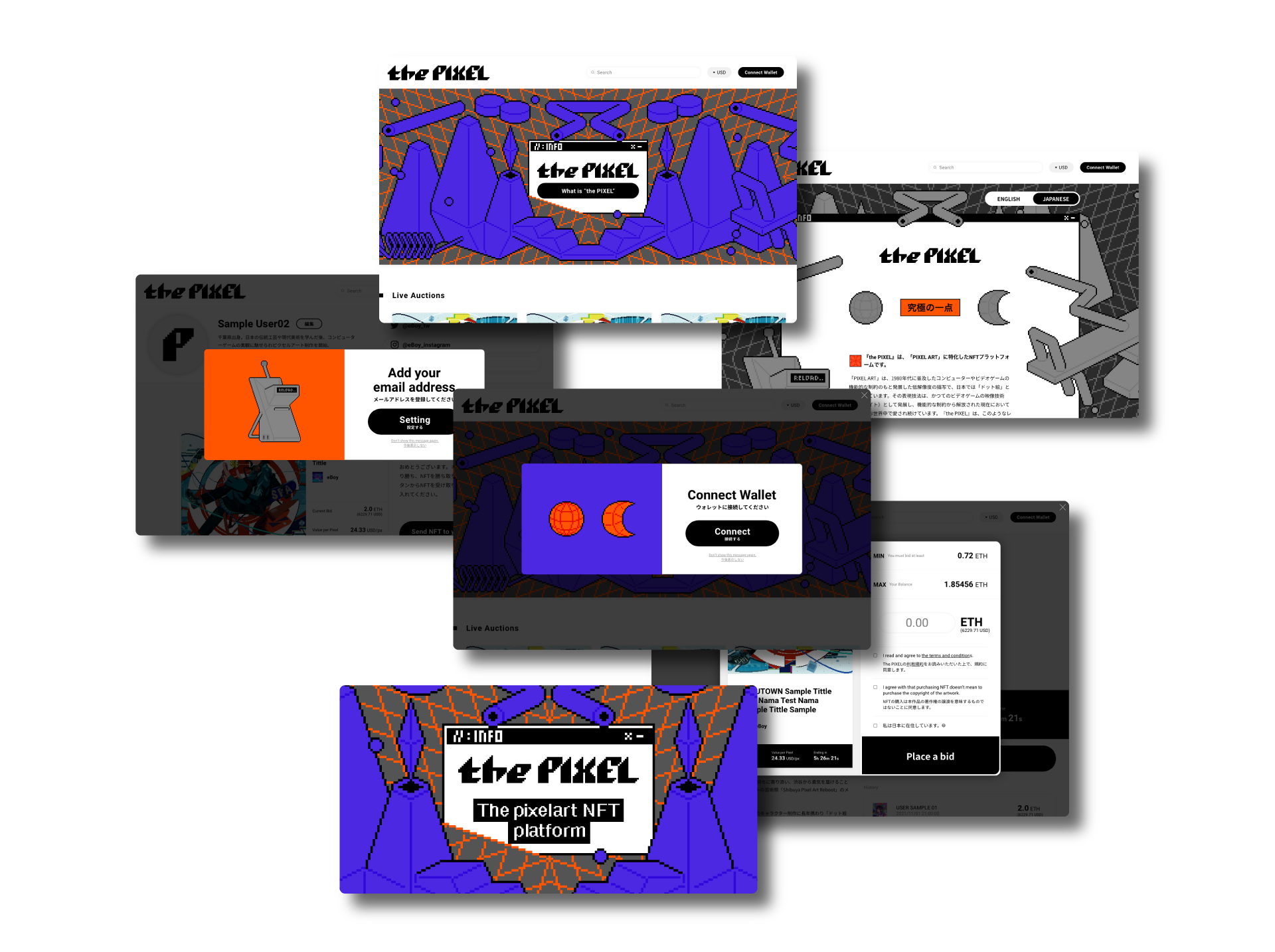
the PIXELは、ピクセルアートを起点に、アーティスト支援、IP開発、空間演出、アートプロジェクトなどへ展開するプロジェクト/プラットフォームです。渋谷を舞台にピクセルアートを都市空間へ広げる芸術祭「SHIBUYA PIXEL ART」をはじめ、日本初となるピクセルアートに特化したNFTプラットフォーム「the PIXEL NFT」や、ピクセルアート専門のウェブマガジン「the PIXEL MAGAZINE」、次世代のピクセルアーティストを育てる実践の場「the PIXEL SCHOOL」などを通して、ピクセルアートを展示・販売・批評・記録・コミュニティへ接続し、ひとつの文化圏として広げています。
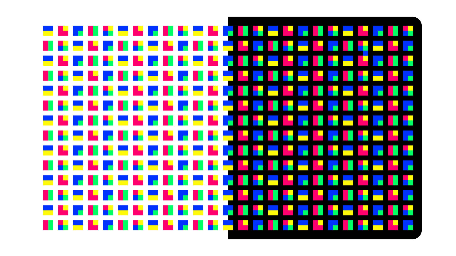
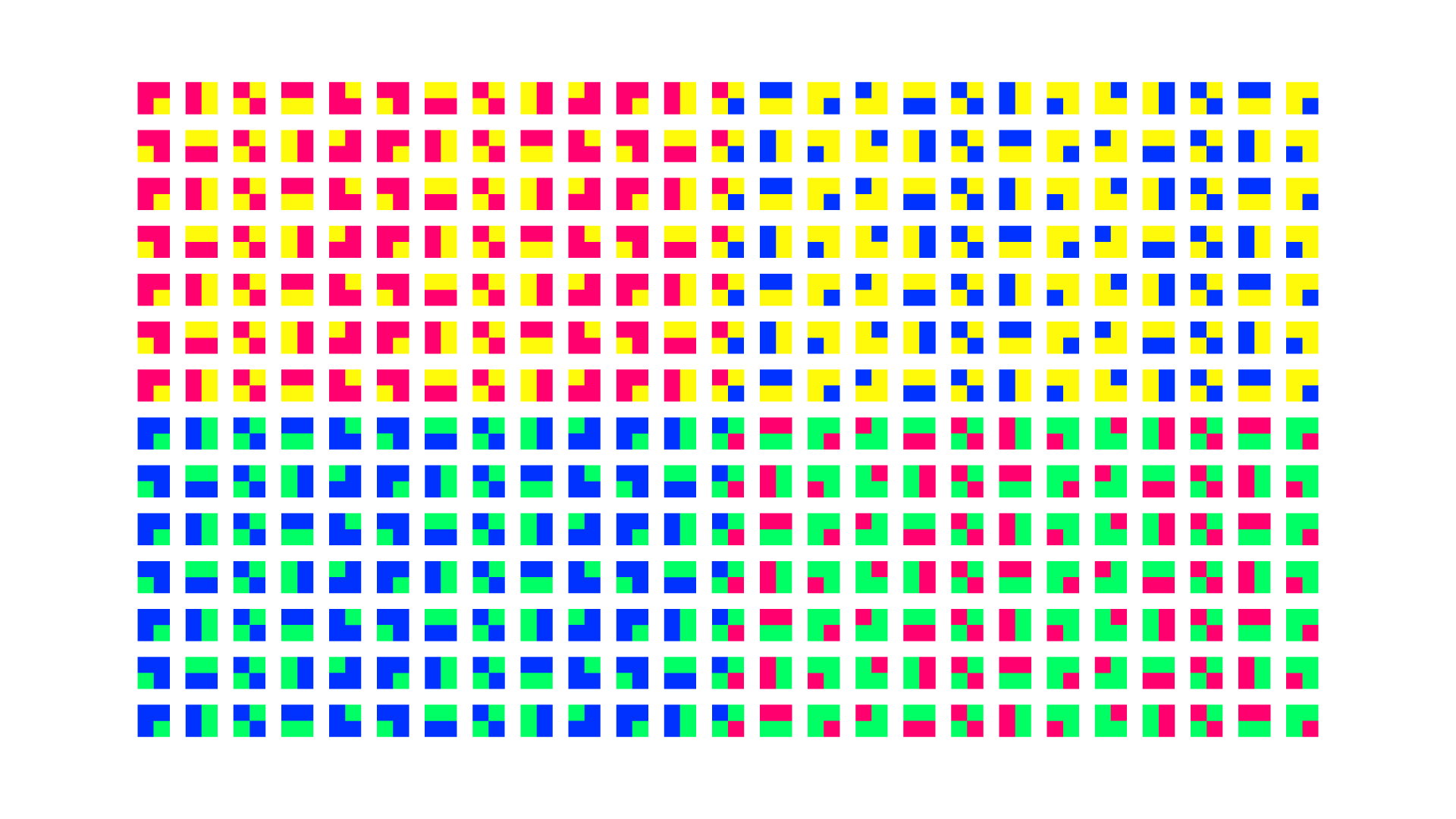
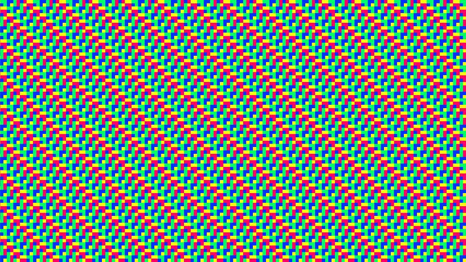
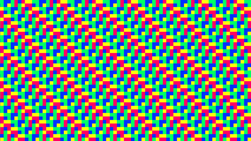
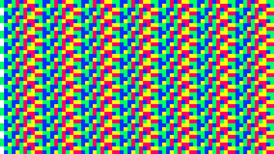
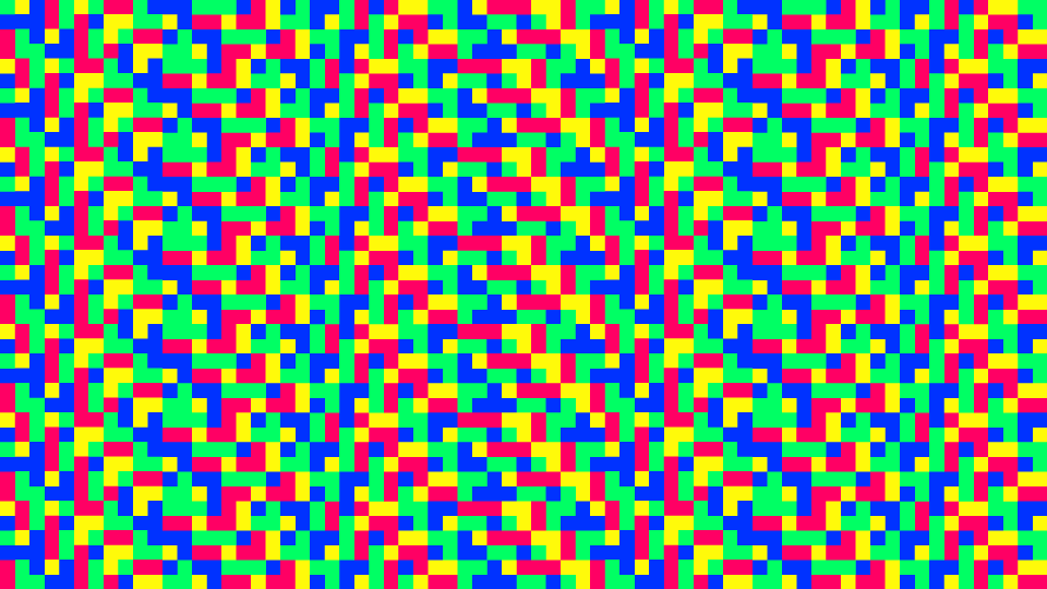
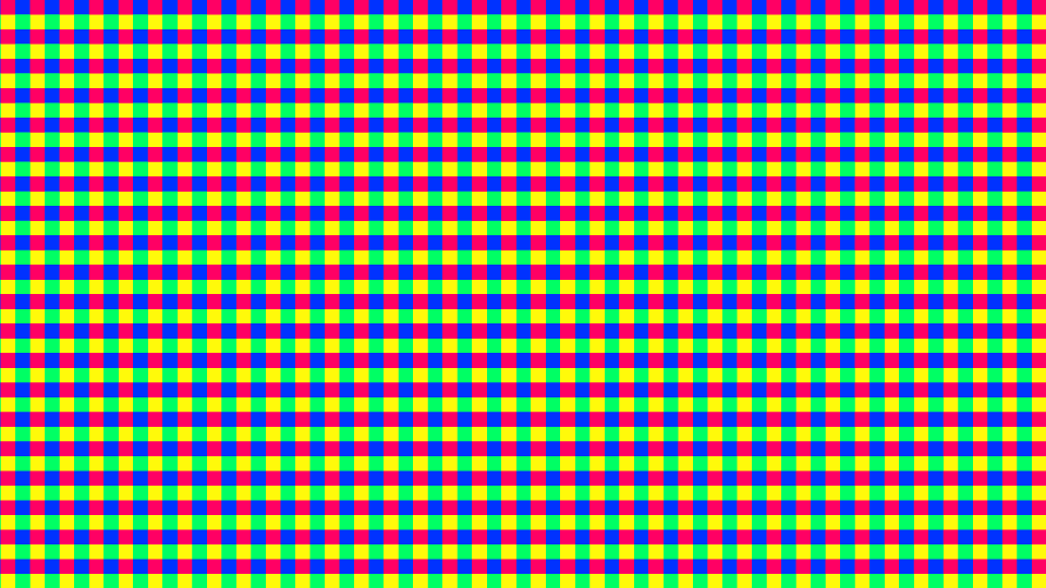
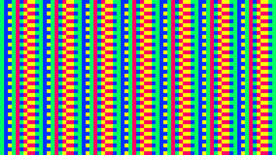
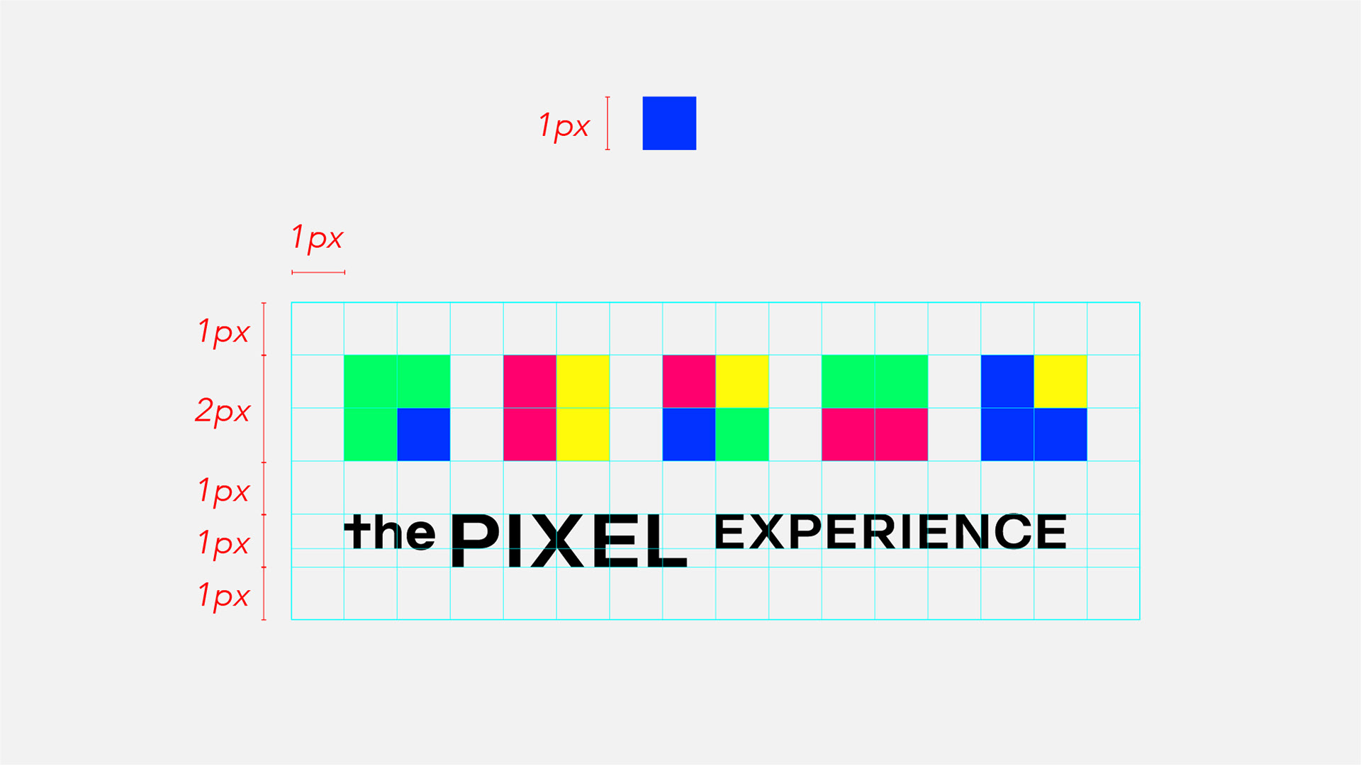
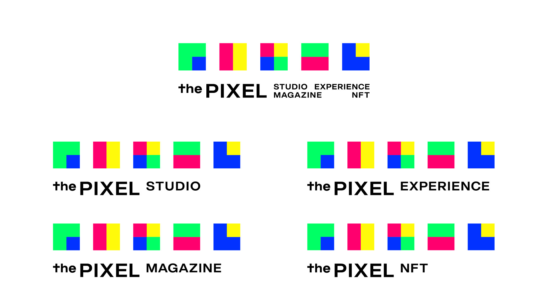
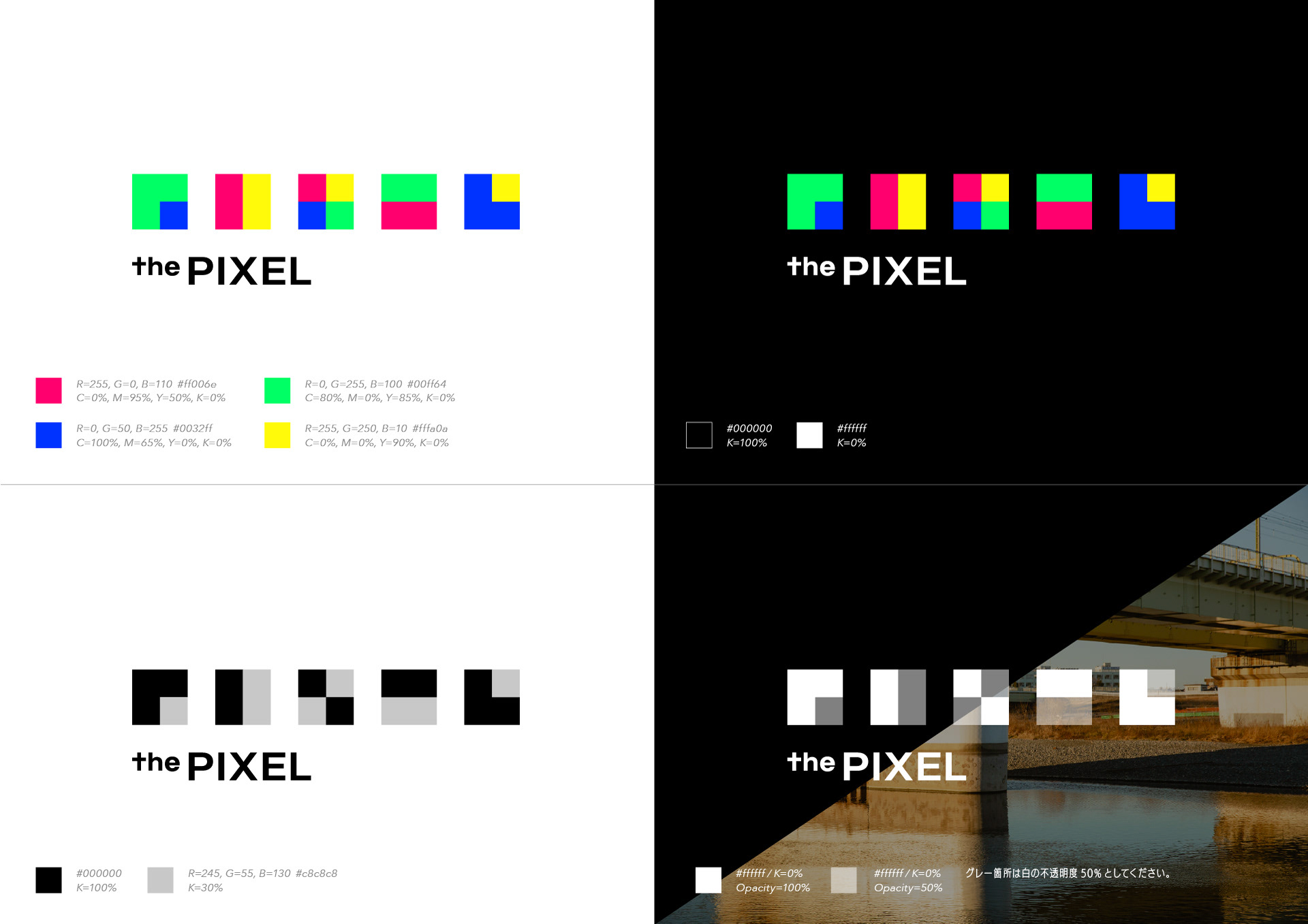
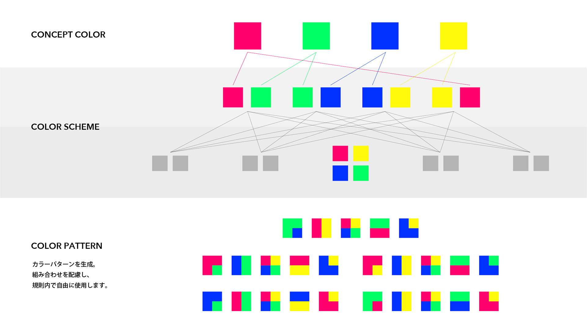
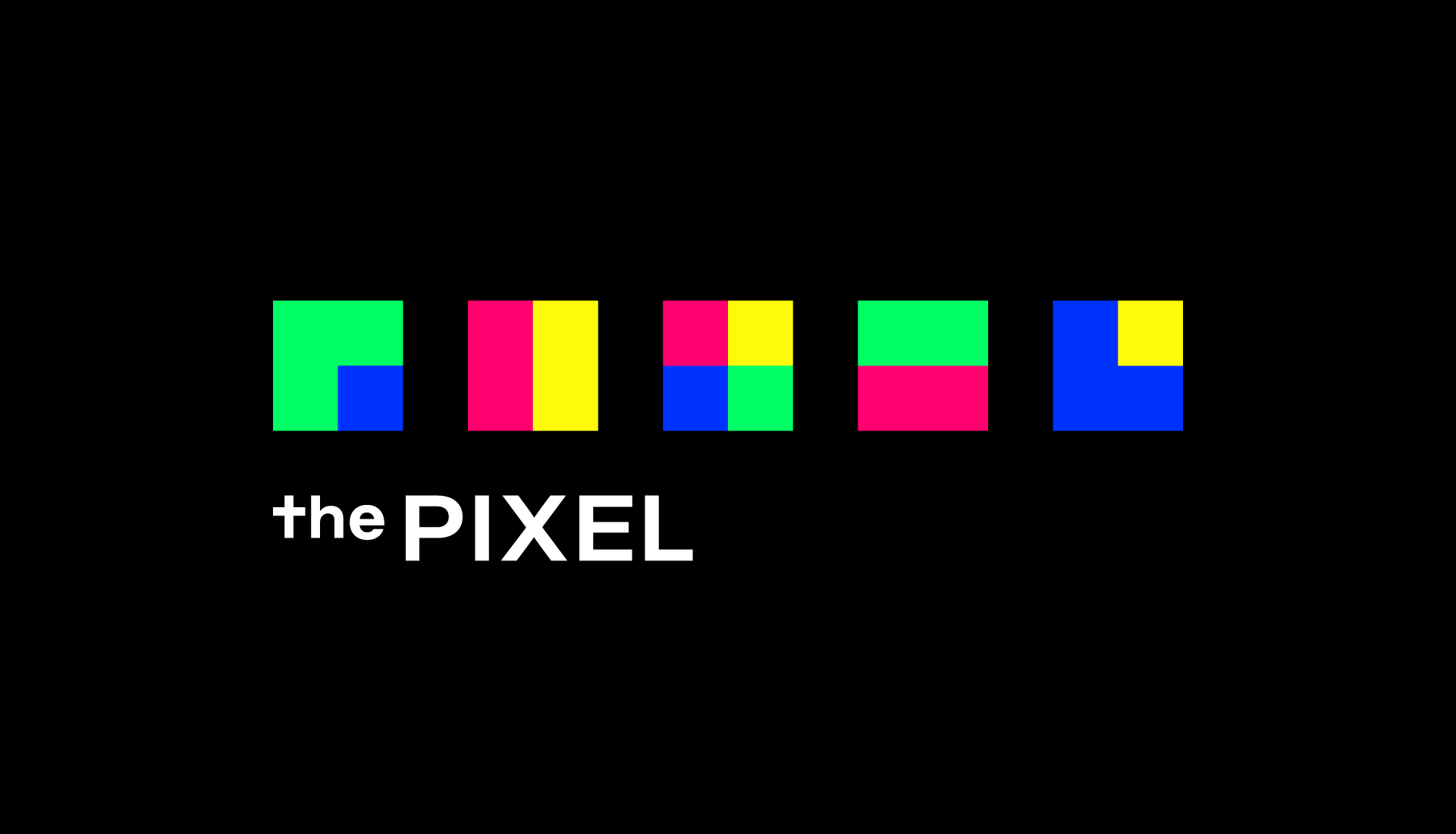
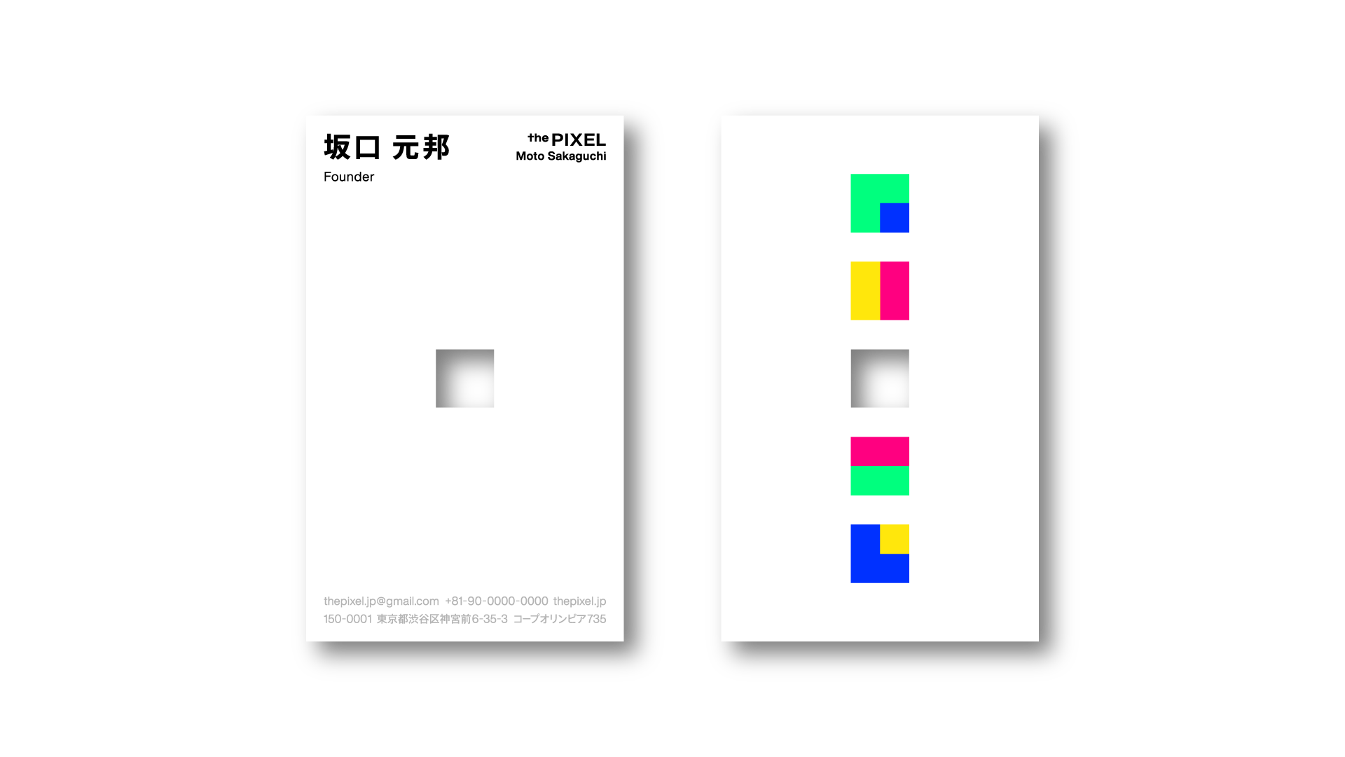
VIでは、最小限のピクセルの組み合わせからアイデンティティを立ち上げることを目指し、2×2pxのタイポグラフィによって「P / I / X / E / L」を構成しました。最小単位としてのピクセルが集まることで文字や記号、イメージ、世界が生まれていく構造を可視化しています。小さな点の集合に宇宙を見るように、限られた単位から無限の広がりを想像すること。そこには、ピクセルアートが持つ制約と豊かさ、そして「LESS IS MORE」の思想を重ねています。
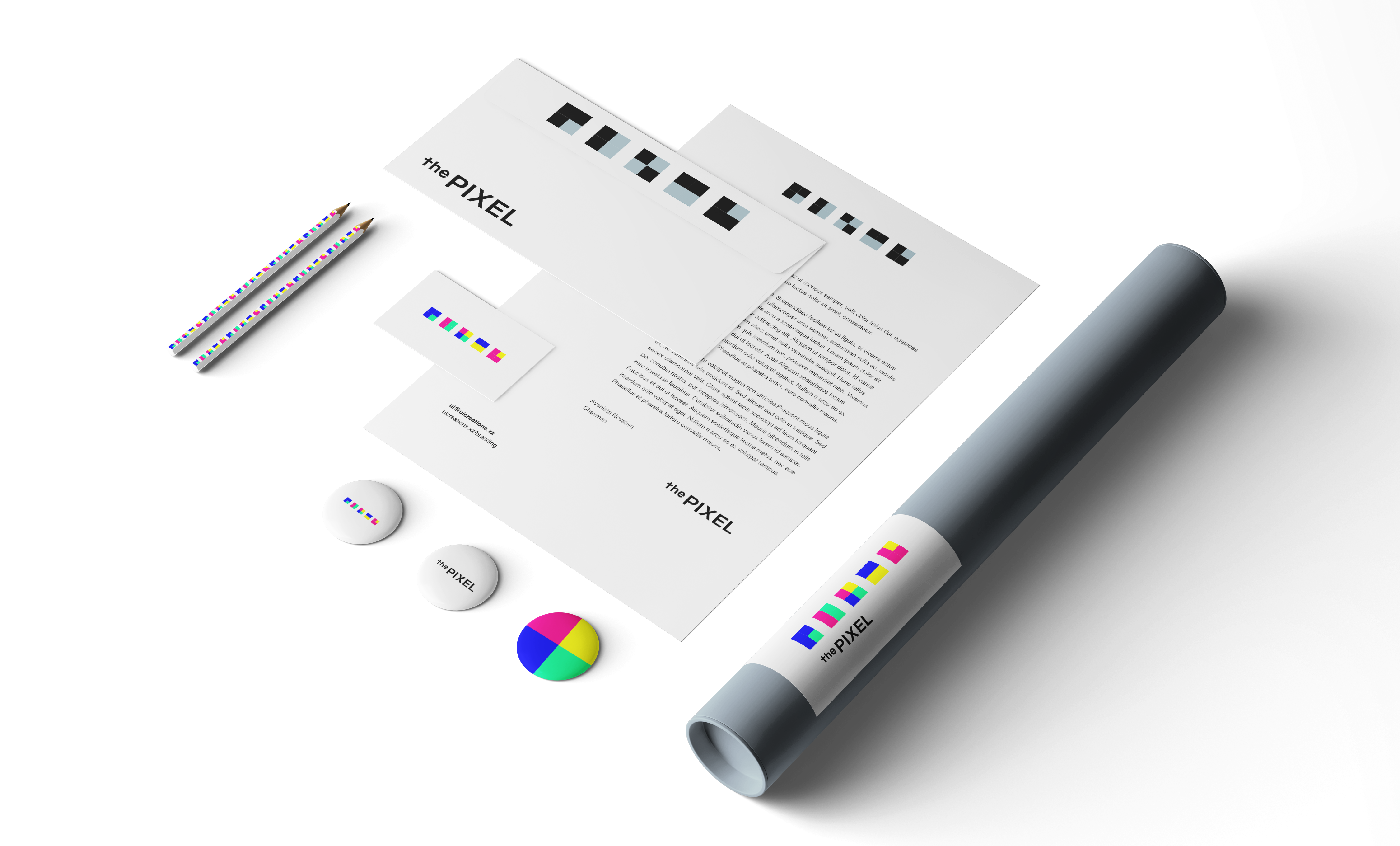
ピクセルが文化を繋げるための視覚言語となるように設計しました。
ピクセルが文化を繋げるための視覚言語となるように設計しました。
the PIXEL is a project and platform that takes pixel art as its starting point and expands into artist support, IP development, spatial production, and art projects. Through initiatives such as SHIBUYA PIXEL ART, an art festival that brings pixel art into the urban space of Shibuya; the PIXEL NFT, Japan’s first NFT platform dedicated to pixel art; the PIXEL MAGAZINE, a web magazine specializing in pixel art; and the PIXEL SCHOOL, a practical platform for nurturing the next generation of pixel artists, the project connects pixel art to exhibition, sales, criticism, documentation, and community, expanding it as a cultural sphere of its own.
For the VI, I aimed to build an identity from the smallest possible combination of pixels, constructing the letters “P / I / X / E / L” with 2×2 px typography. The design visualizes the structure in which pixels, as the smallest units, gather to form letters, symbols, images, and worlds. Like seeing a universe in a cluster of tiny dots, it imagines infinite expansion from limited units. This approach overlaps the constraints and richness inherent to pixel art with the philosophy of “LESS IS MORE.” I designed the identity as a visual language through which pixels can connect culture.