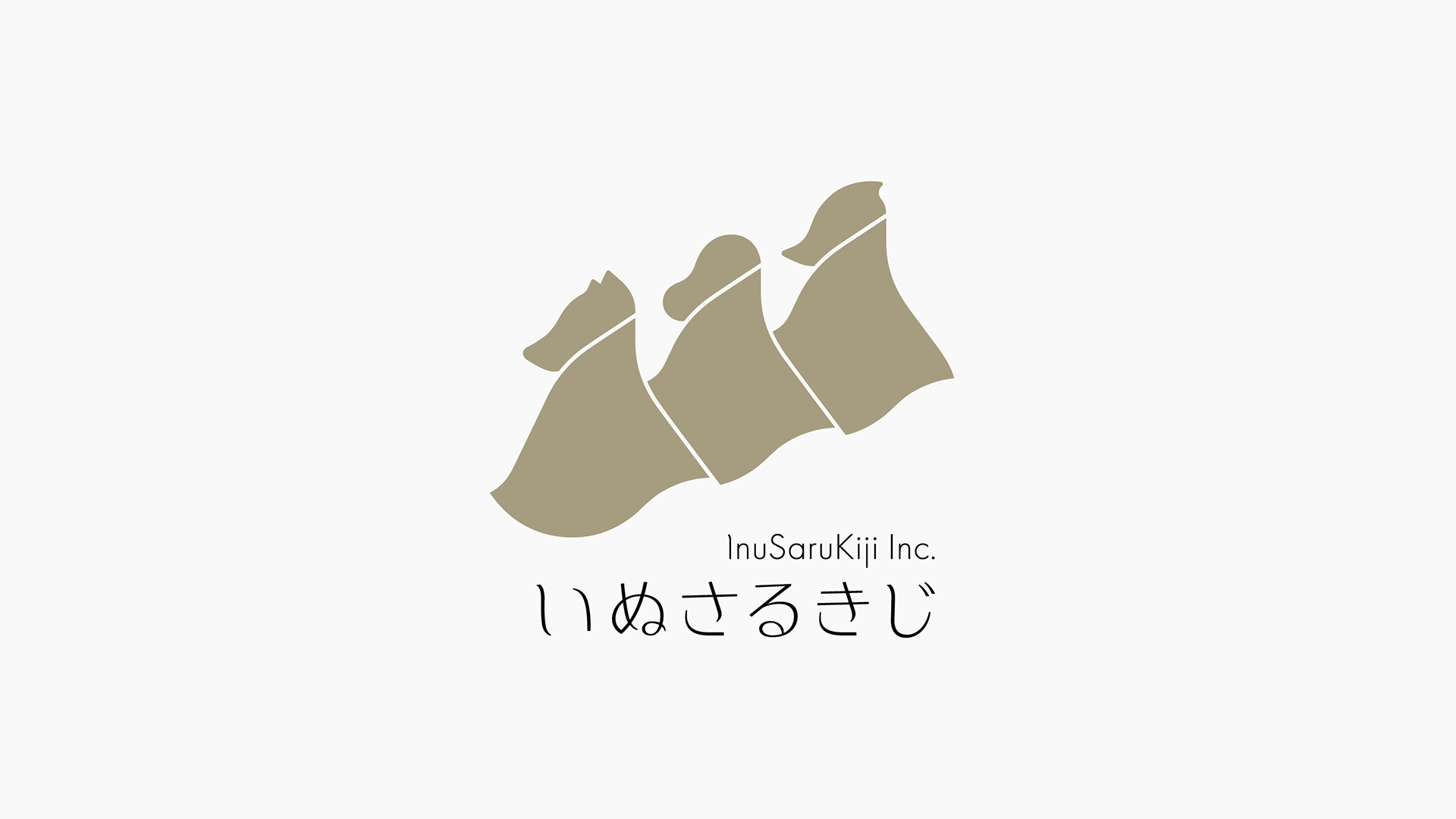
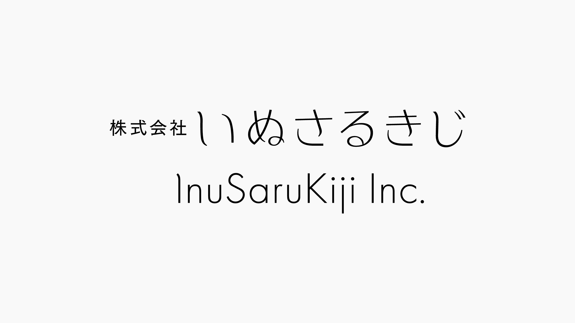
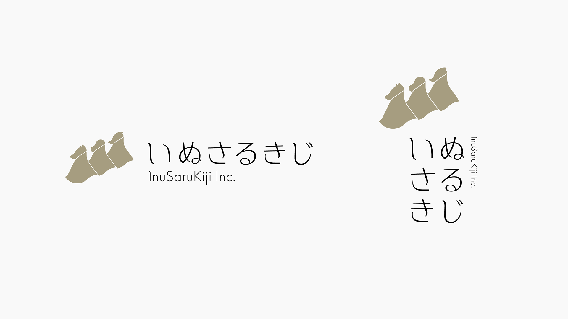
岡山県で新たに事業を始める人を支援するために設立されたローカルファンド「株式会社いぬさるきじ」。新規事業者とビジョンを共有し、リソースを提供する頼もしいパートナーとして、郷土に関わりの深い物語をモチーフに千日デザインアソシエーションにて社名を考案、ビジネスのグランドデザインとなるスローガンを策定。それをもとにCI/VIを開発・構築、ビジネスツールのデザインを行いました。
InuSaruKiji Inc. is a local fund established to support people starting new businesses in Okayama Prefecture. As a reliable partner who shares visions and provides resources to new businesses, Sennichi Design Association devised a company name based on a story closely related to the local area, and formulated a slogan to serve as the grand design for the business. Based on this, we developed and built the CI/VI and designed the business tools.
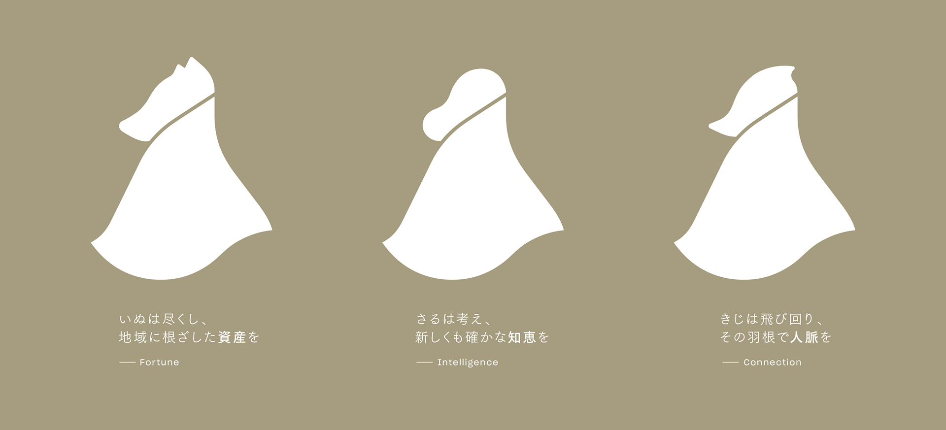
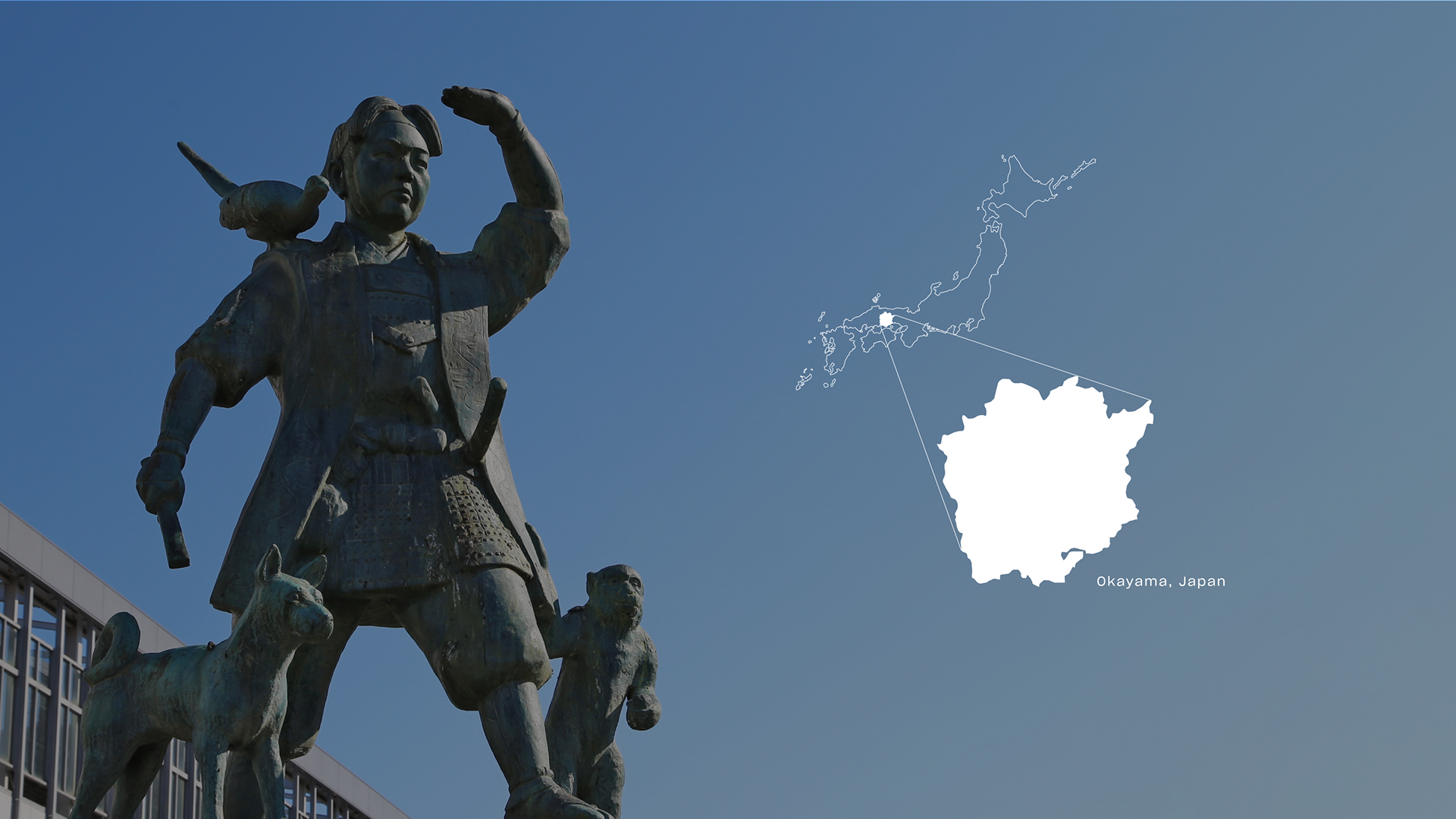
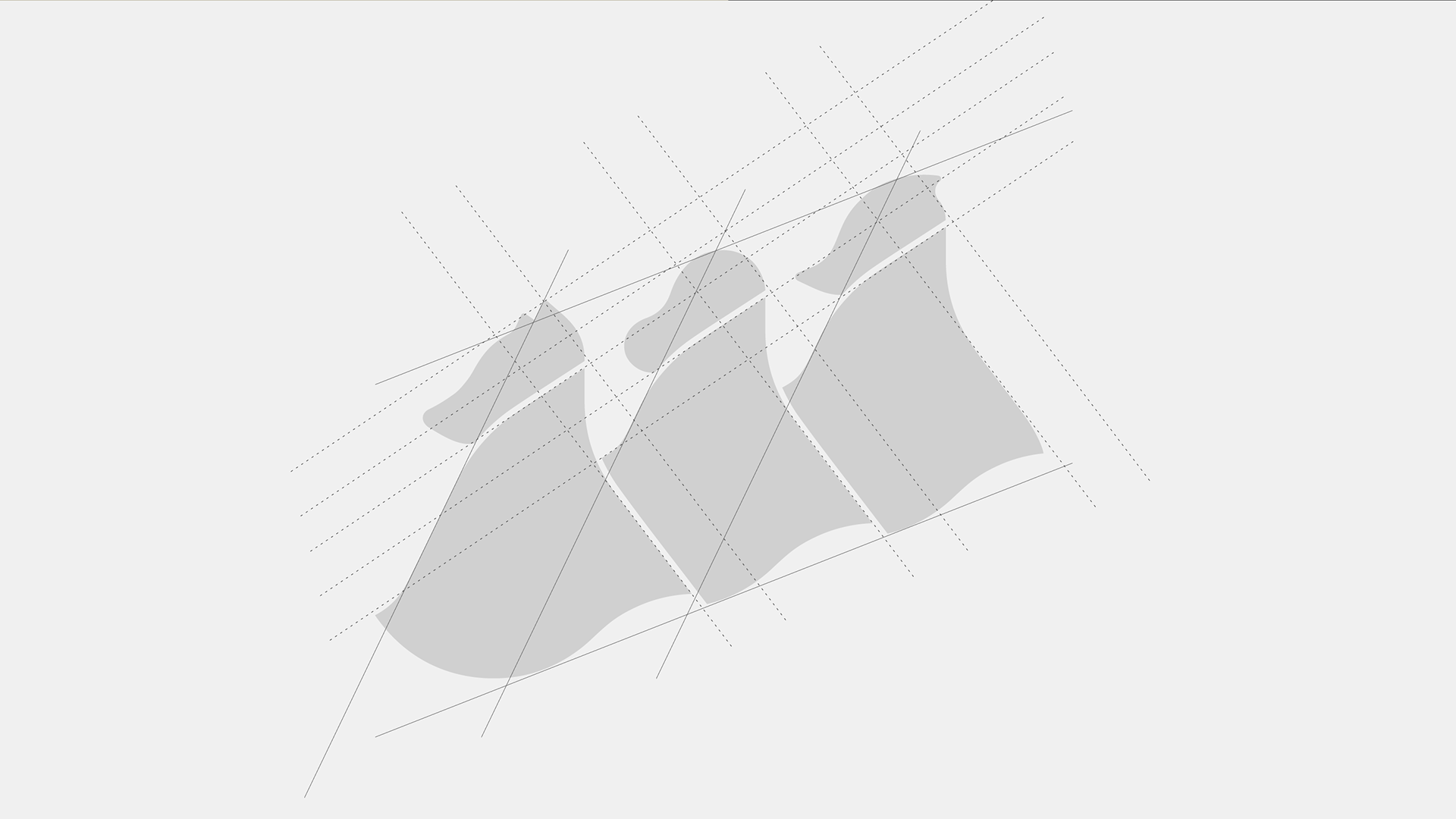
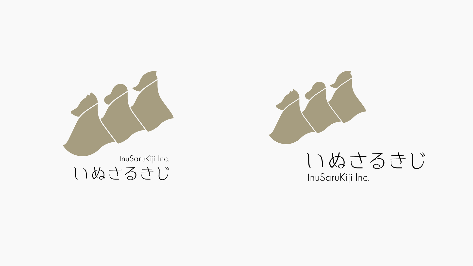
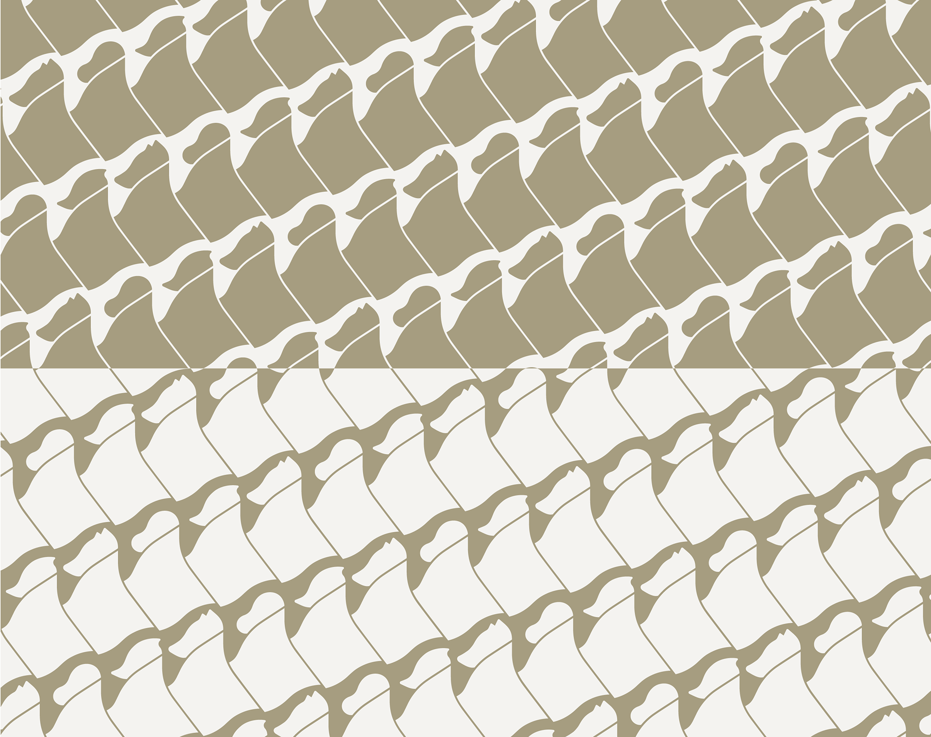
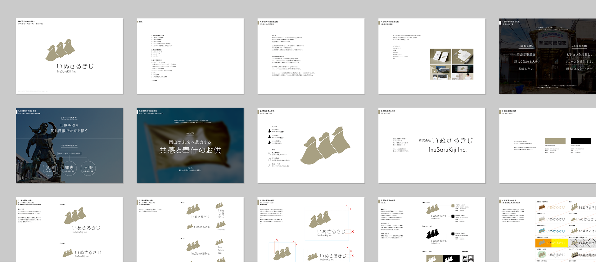
シンボルマークのいぬ・さる・きじは、それぞれ《資産・知恵・人脈》を表すものです。背中を見せる構図は、謙虚でありながらも信頼感を持った頼もしいパートナーを思わせます。さらに、桃太郎の見ている視線をともにし、支援する事業者への共感やチームワークを示します。また、優しい風に揺れるマントは新しいムーブと岡山の穏やかな気候を感じさせます。
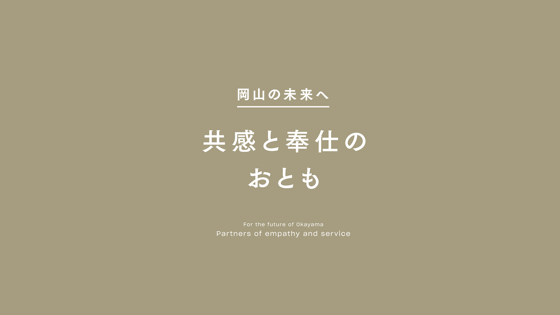
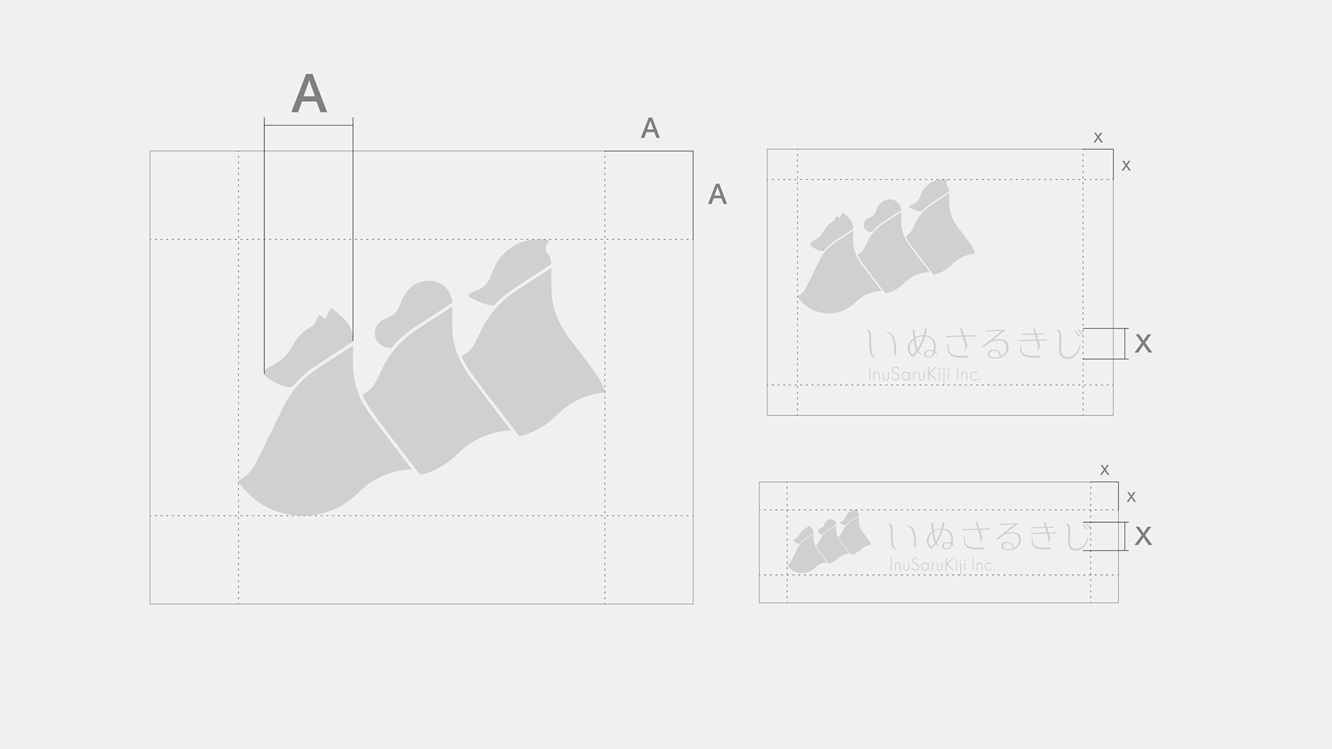
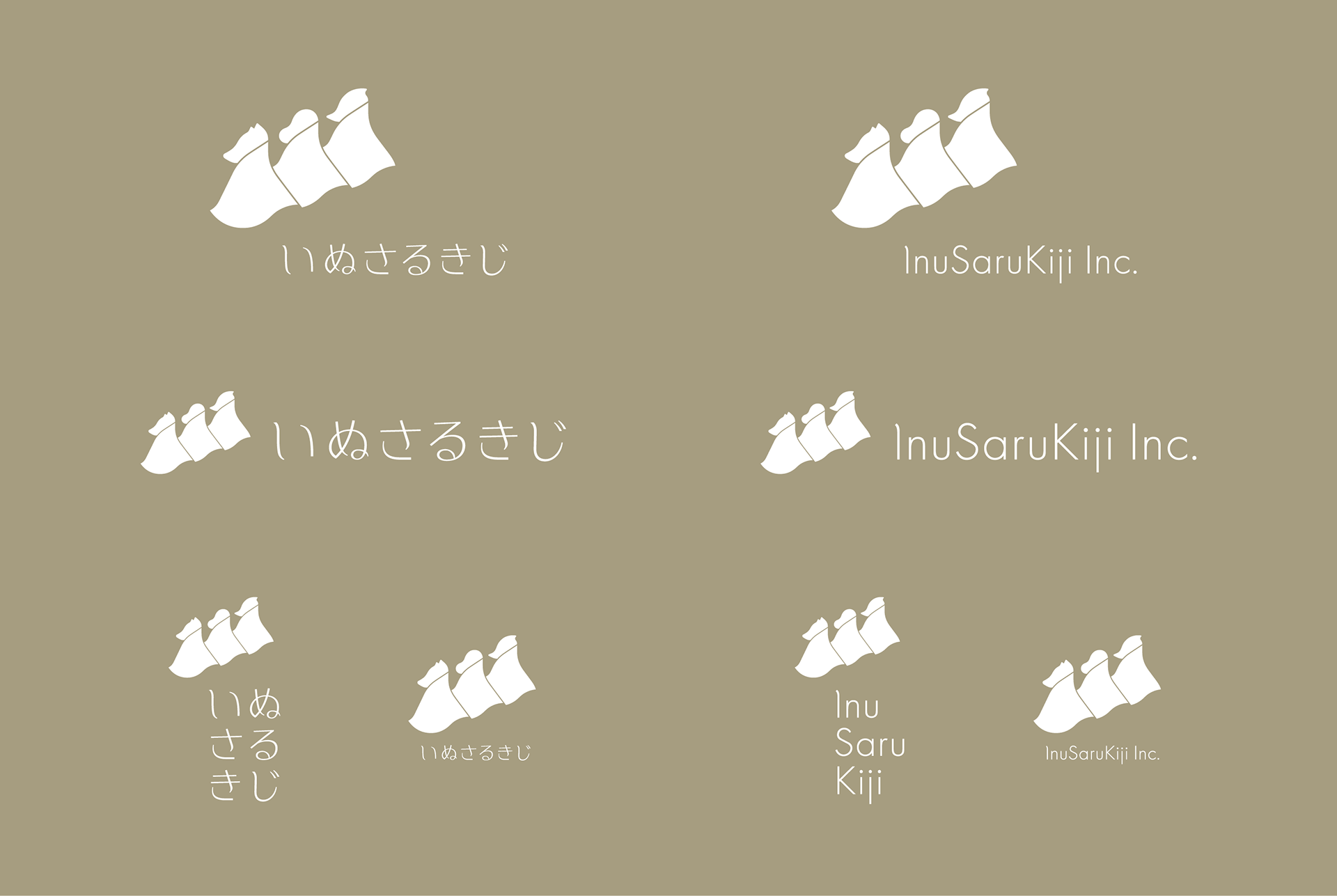
ロゴタイプと配色は、シンボルマークと合わさることで新しい物語のはじまりを想起させます。
ロゴタイプと配色は、シンボルマークと合わさることで新しい物語のはじまりを想起させます。
The symbol mark of a dog, a monkey, and a pheasant represent "assets, wisdom, and human connections" respectively. The composition of the logo, showing his back, reminds us of a humble yet trustworthy partner. In addition, Momotaro's gaze is shared, showing his sympathy and teamwork with the businesses he supports. In addition, the cape swaying in the gentle breeze evokes new moves and the mild climate of Okayama.
The logotype and color scheme, when combined with the symbol mark, evoke the beginning of a new story.
The logotype and color scheme, when combined with the symbol mark, evoke the beginning of a new story.


Award : 日本タイポグラフィ年鑑2021 入選
Client : InuSaruKiji inc.
Art Direction, Design : Okuyama Taiki
Creative Direction : Otokura Shinji(Sennichi Design Association)